also referred to as numerical data
Numerical Summaries:
- basic information about the data eg. number of observations and missing values
- measures of central tendency eg. mean, median
- measures of speed eg. standard deviation, IQR, range
R Code:
stud_perf <- read.table("data/student/student-mat.csv", sep=";",
header=TRUE)
summary(stud_perf$G3)

sum(is.na(stud_perf$G3))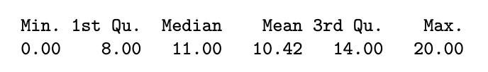
Python Code:
import pandas as pd
import numpy as np

stud_perf = pd.read_csv("data/student/student-mat.csv", delimiter=";")
stud_perf.G3.describe()

# stud_perf.G3.info()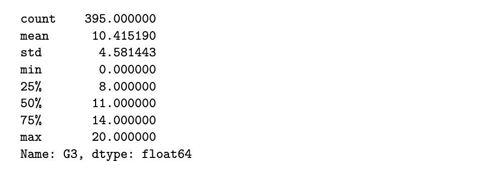
R code
round(aggregate(G3 ~ Medu, data=stud_perf, FUN=summary), 2)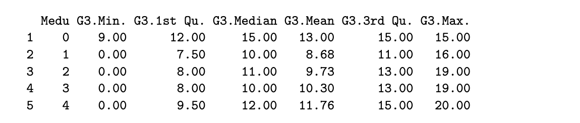
table(stud_perf$Medu)
Python code
stud_perf[['Medu', 'G3']].groupby('Medu').describe()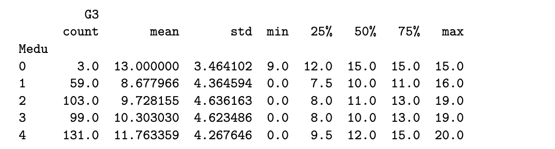
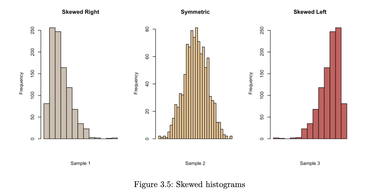
Some things to note about numerical summaries:
- if the mean and median are close to each other, it indicates that the distribution of the data is close to symmetric
- the mean is sensitive to outliers but the median is not
- when the mean is much larger than the median, it suggests that there could be a few very large observations. it has resulted in a right-skewed distribution.
- conversely, if the mean is much smaller than the median, we probably have a left-skewed distribution
Graphical Summaries:
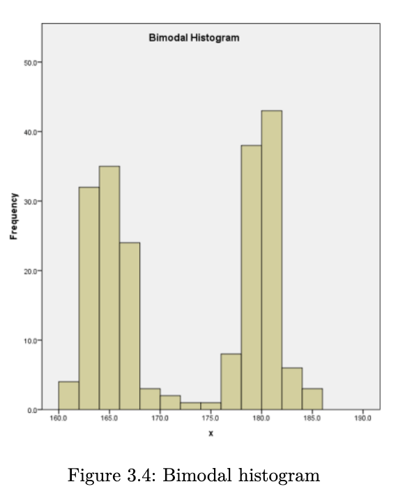
Histograms
when we create a histogram, here are some things that we look for:
- what is the overall pattern? does the data cluster together, or is there a gap such that one or more observations deviate from the rest?
- are there any suspected outliers?
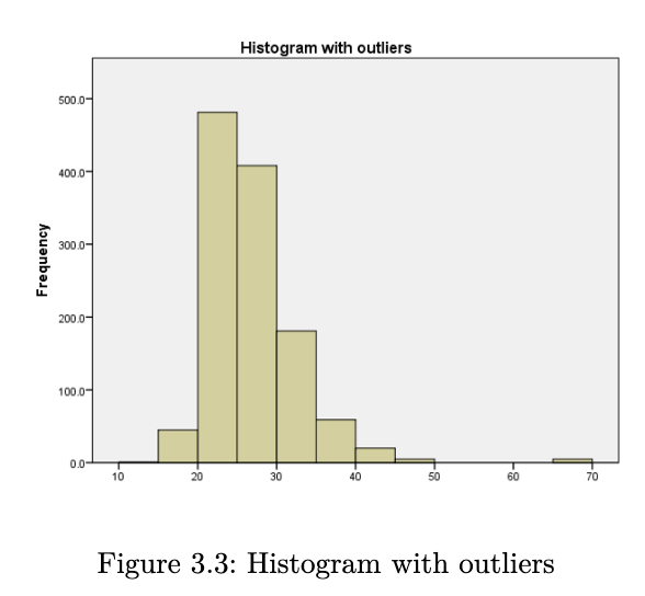
- does the data have a single mound or peak? if yes, then we have what is known as a unimodal distribution. data with two peaks are referred to as bimodal, and data with many peaks are referred to as multimodal.
- is the distribution symmetric or skewed?
R Code
hist(stud_perf$G3, main="G3 Histogram", xlab="G3 scores")Python Code
fig = stud_perf.G3.hist(grid=False)
fig.set_title('G3 histogram')
fig.set_xlabel('G3 scores');
it is not useful to inspect a histogram in a silo. condition on explanatory variable and create separate histograms for each group.
library(lattice)
histogram(~G3 | Medu, data=stud_perf, type="density",
main="G3 scores, by Medu levels", as.table=TRUE)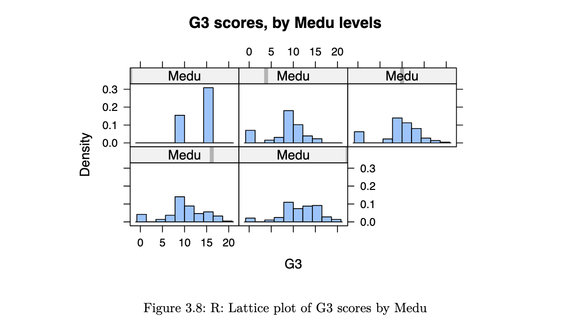
stud_perf.G3.hist(by=stud_perf.Medu, figsize=(15,10), density=True,
layout=(2,3));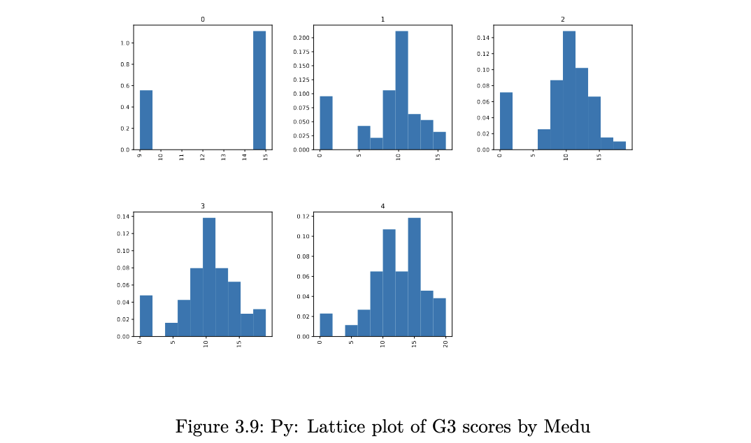
Density Plots
histograms are not perfect - when using them, we have to experiment with the bin size since this could mask details about the data. it is also easy to get distracted by the blockiness of histograms. an alternative to histograms is the kernel density plot. essentially, this is obtained by smoothing the heights of the rectangles in a histogram.
suppose we have observed an iid sample x1, x2 … xn from a continuous pdf f(⋅). then the kernel density estimate at x is given by:
where:
- K is a density function. a typical choice is the standard normal. the kernel places greater weights on nearby points (to x)
- h is a bandwidth, which determines which of the nearest points are used. the effect is similar to the number of bins in a histogram
R code
densityplot(~G3, groups=Medu, data=stud_perf, auto.key = TRUE,
main="G3 scores, by Medu", bw=1.5)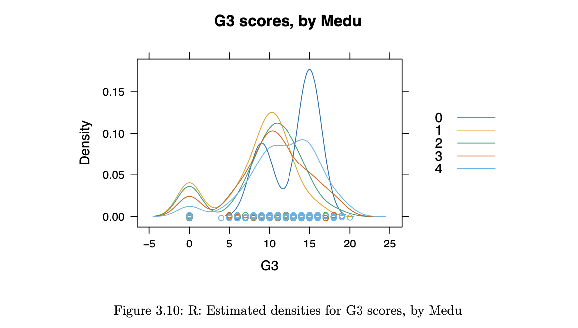
Python code
import matplotlib.pyplot as plt
f, axs = plt.subplots(2, 3, squeeze=False, figsize=(15,6))
out2 = stud_perf.groupby("Medu")

for y,df0 in enumerate(out2):
	tmp = plt.subplot(2, 3, y+1)
	df0[1].G3.plot(kind='kde')
	tmp.set_title(df0[0])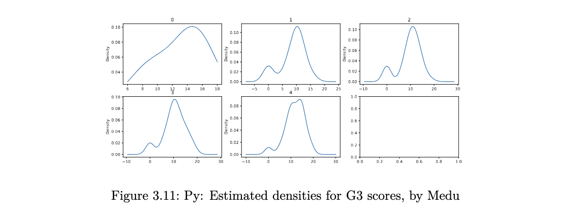
Boxplots
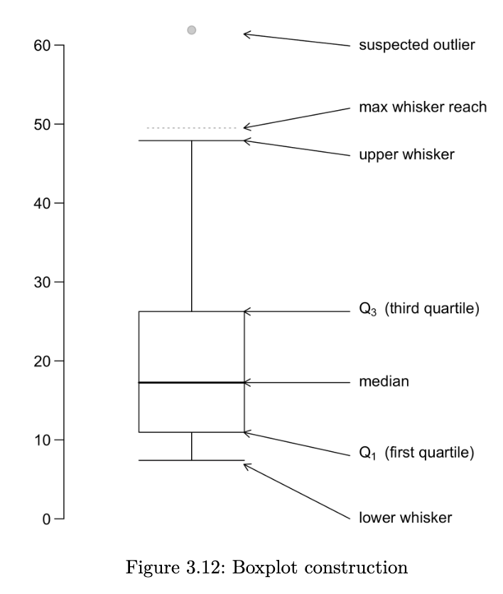
a boxplot provides a skeletal representation of a distribution. boxplots are very well suited for comparing multiple groups. here are the steps for drawing a boxplot:
- determine Q1, Q2 and Q3. the box is made from Q1 and Q3. the median is drawn as a line or a dot within the box
- determine the max-whisker reach: Q3 + 1.5 x IQR; the min-whisker reach by Q1 - 1.5 x IQR
- any data point that is out of the range from the min to max whisker reach is classified as a potential outlier
- excluding the potential outliers, the maximum point determines the upper whisker and the minimum point determines the lower whisker of a boxplot
a boxplot helps us to identify the median, lower and upper quantiles and outlier(s)
R code
bwplot(G3 ~ goout, horizontal = FALSE, main="G3 scores, by goout",
		xlab="No. of times the student goes out per week",
		data=stud_perf)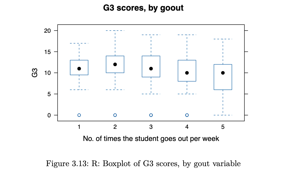
Python code
stud_perf.plot.box(column='G3', by='goout',
				xlabel='No. of times student goes out per week');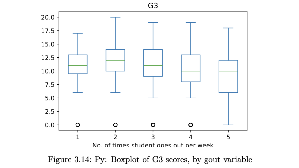
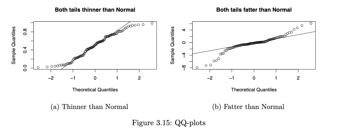
QQ-plots
a QQ-plot plots the standardised sample quantiles against the theoretical quantiles of a N(0,1) distribution. if the points fall on a straight line, then we say there is evidence that the data comes from a Normal distribution.
especially for unimodal datasets, the points in the middle will typically fall close to the line. the value of a QQ-plot is in judging if the tails of the data are fatter or thinner than the tails of the Normal.
R code
qqnorm(concrete$Comp.Strength)
qqline(concrete$Comp.Strength)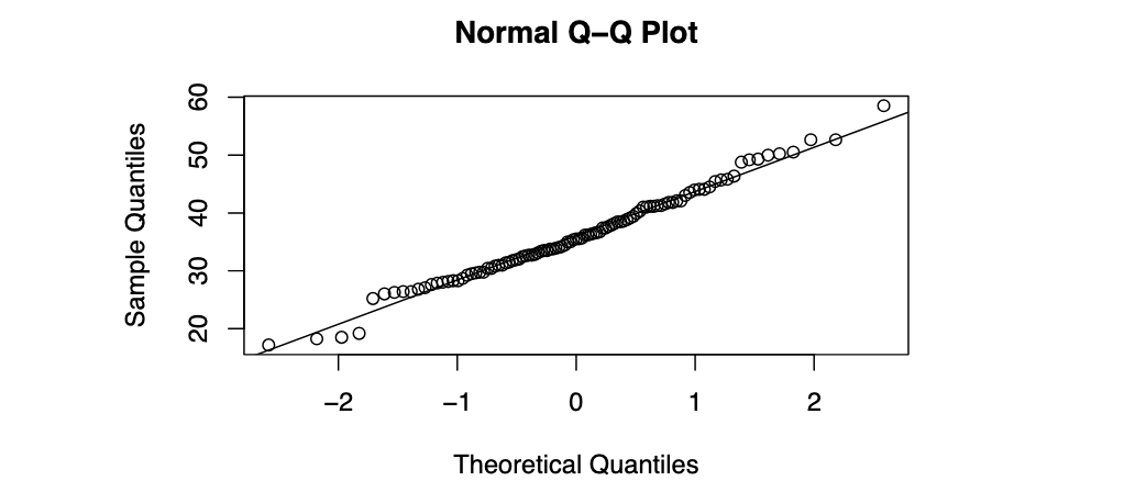
Python code
from scipy import stats
import statsmodels.api as sm
sm.qqplot(concrete.Comp_Strength, line="q");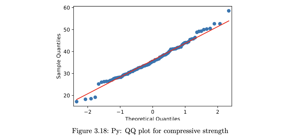
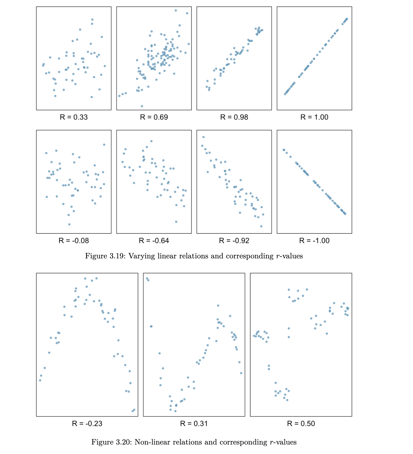
Correlation
when we are studying two quantitative variables, the most common numerical summary to quantify the relationship between them is the correlation coefficient.
suppose that x1, x2, … xn and y1, … , yn are two variables from a set of n objects or people. the sample correlation between these two variables is computed as:
where sx and sy are the sample standard deviations. r is an estimate of the correlation between random variables X and Y.
a few things to note about the value r, which is also referred to as the Pearson correlation:
- r is always between -1 and 1
- a positive value for r indicates a positive association and a negative value for r indicates a negative association
- two variables have the same correlation, no matter which one is coded as X and which is coded as Y
Scatterplot Matrices
when we have multiple quantitative variables in a dataset, it is common to create a matrix of scatterplots. this allows for simultaneous inspection of bivariate relationships.
R code
col_to_use <- c("Cement", "Slag", "Comp.Strength", "Water", "SLUMP.cm.", "FLOW.cm.")
pairs(concrete[, col_to_use], panel = panel.smooth)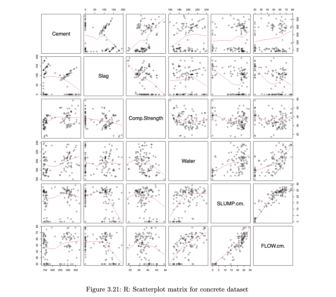
Python code
pd.plotting.scatter_matrix(concrete[['Cement', 'Slag',  'Comp_Strength', 'Water', 'SLUMP(cm)', 'FLOW(cm)']],
figsize=(12,12));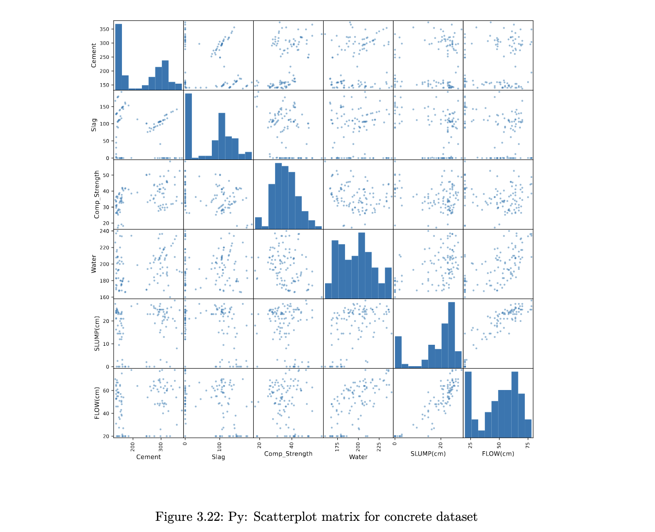
the scatterplots allow a visual understanding of the patterns, but it is usually also good to compute the correlation of all pairs of variables
Correlation Plot
R code
library(psych)
corPlot(cor(concrete[, col_to_use]), cex=0.8, cex.axis=0.6,
	show.legend = FALSE)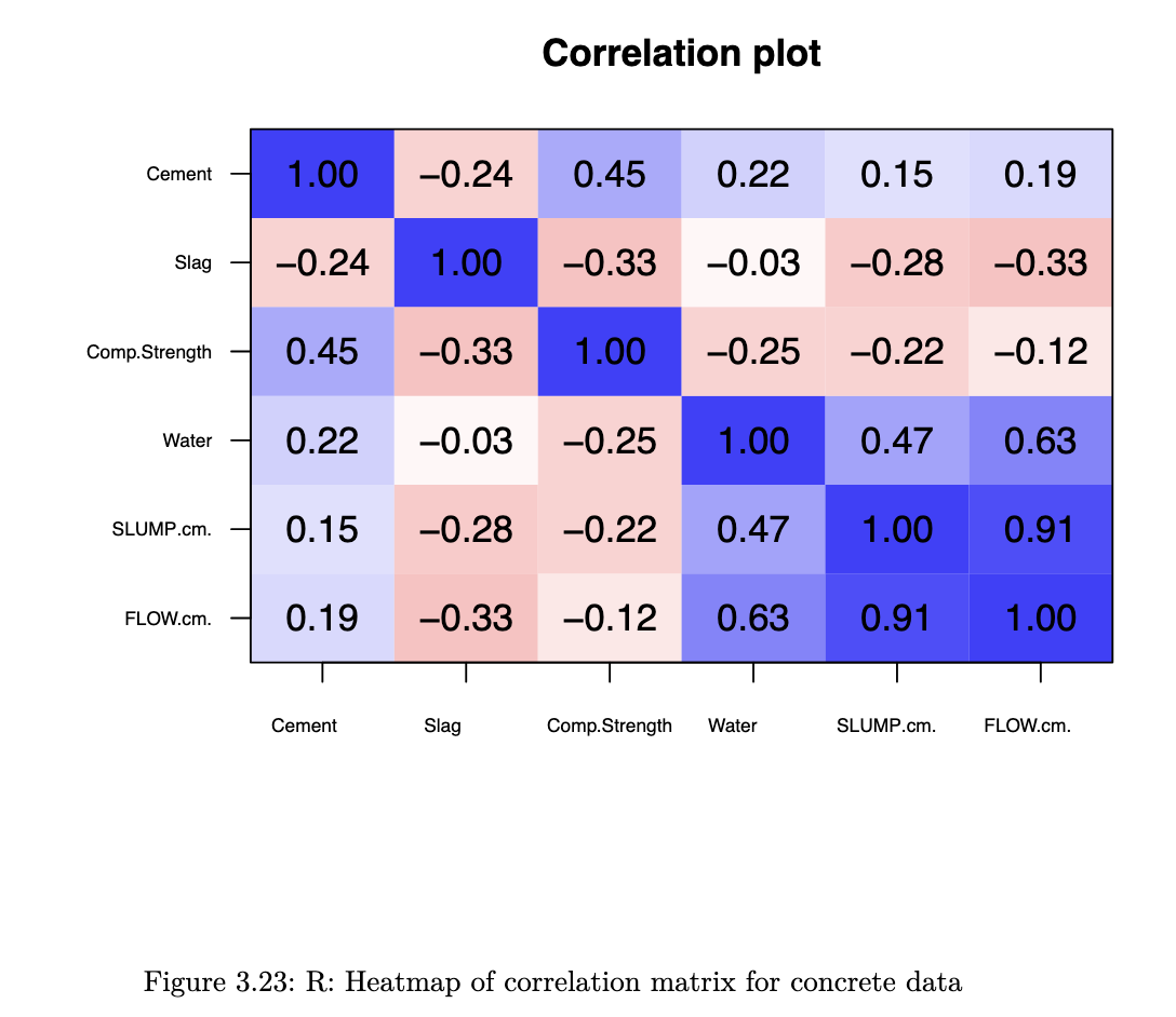
Python code
corr = concrete[['Cement', 'Slag', 'Comp_Strength', 'Water',
				'SLUMP(cm)', 'FLOW(cm)']].corr()
corr.style.background_gradient(cmap='coolwarm_r')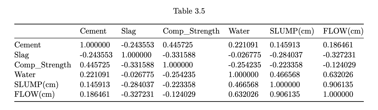
heatmaps enable us to pick out groups of variables that are similar to one another.
stuff not in lec notes:
On Lattice Plots:
- Conditioning (|) vs Grouping (groups=):
- | creates separate panels (small multiples)
- groups= OVERLAYS on same panel
Box Plot Construction:
- find Q1, median, Q3 → draw box
- calculate IQR = Q3 - Q1
- upper boundary = Q3 + 1.5 x IQR
- lower boundary = Q1 - 1.5 x IQR
- whiskers go to LARGEST / SMALLEST points WITHIN boundaries
- plot individual points beyond boundaries as suspected outliers
note: after log transform, should RECOMPUTE Q1, Q3, IQR, boundaries
QQ-Plot interpretation:
How to Construct:
- standardise data:
x_i = (y_i - mean) / sd - order data: ascending x_i
- compute empirical quantiles: x_i is the (i/n)-quantile
- get theoretical normal quantiles: qnorm(i/n)
- plot: theoretical (x-axis) vs empirical (y-axis)
Reading the Plot:
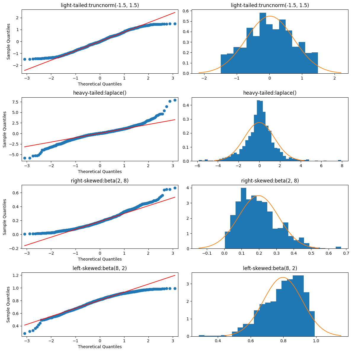
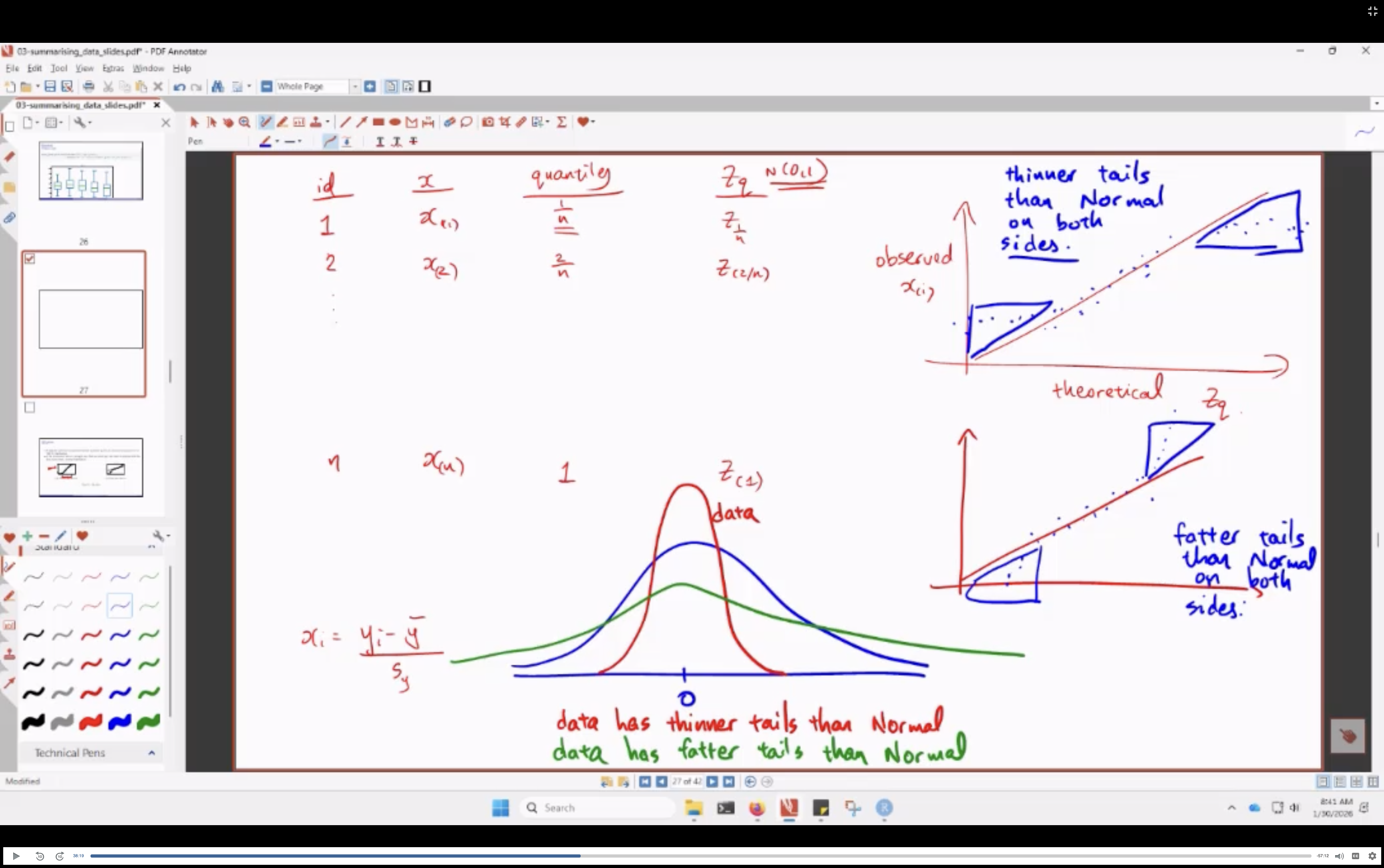
- how i make sense of this:
- less extreme tails: (highs are lower than norm, lows are higher than norm): thinner tails
- more extreme tails: (highs are higher than norm, lows are lower than norm): fatter tails
Rootogram (Python)
A rootogram plots square-root residuals of observed vs expected counts — useful for assessing Poisson fit. Bars coloured by sign (blue = observed > expected, red = observed < expected).
# Compute
rootogram_df['res'] = np.sqrt(rootogram_df['obs']) - np.sqrt(rootogram_df['exp'])
rootogram_df['color'] = np.where(rootogram_df['res'] > 0, 'blue', 'red')

# Plot
rootogram_df['res'].plot(kind='bar', color=rootogram_df['color'],
    rot=1.0, xlabel='Goals For in a Game', ylabel='Residual',
    title='Rootogram for Liverpool GF', ylim=[-2, 2])
plt.axhline(y=0.0, linestyle='--', color='gray')
Why sqrt-transform? Raw counts are skewed; square root stabilises variance and makes the distribution closer to symmetric (especially for Poisson data).
On Density Plots:
Bandwidth Problem:
- bandwidth too small: spiky / noisy
- bandwidth too large: over-smoothed
- play around with the bw until it agrees with your intuition
Boundary Problem: - density estimates can extend beyond where your data actually exists
- FIX:
- identify boundary point (eg. 0)
- reflect data around boundary
- estimate density on extended data
- discard reflected portion
- results in density that levels off nicely at boundary
See also: Numpy Glossary · Pandas Glossary · Matplotlib Glossary