Introduction
Regression analysis is a technique for investigating and modelling the relationship between variables like X and Y, using X to estimate Y. In these cases, we refer to X as the explanatory or independent variable. It is also sometimes referred to as a predictor. Y is referred to as the response or dependent variable.
Regression models are used for two primary purposes:
- to understand how certain explanatory variables affect the response variable. This aim is typically known as estimation, since the primary focus is on estimating the unknown parameters of the model.
- to predict the response variable for new values of the explanatory variables. this is referred to as prediction
This course focuses on the estimation aim.
Example 9.1 (Concrete Data: Flow on Water)
Recall that we first saw this dataset in L3 Exploring Quantitative Data
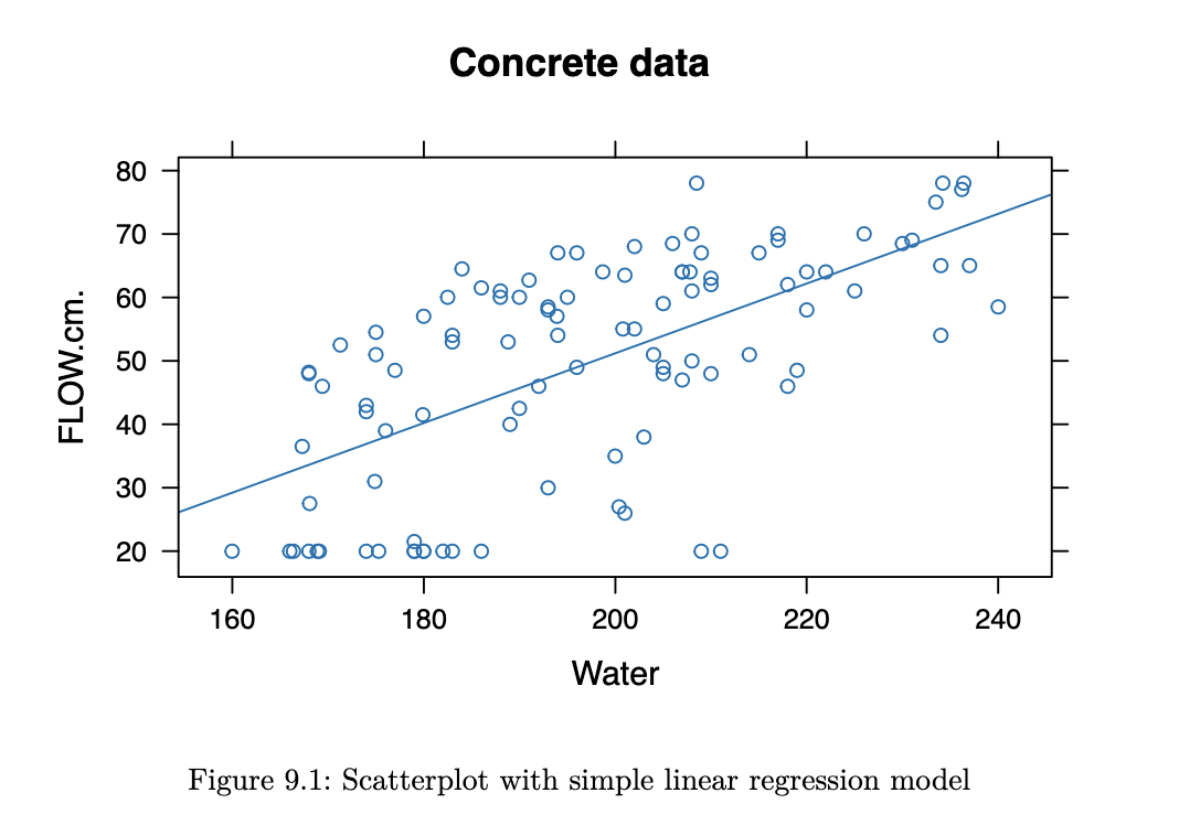
The fitted regression model here estimates the relationship between the output of the flow test, and the amount of water used to create the concrete. Note that trend in the scatterplot. In this topic, we will figure out how to estimate this line.
Example 9.2 (Bike Rental Data)
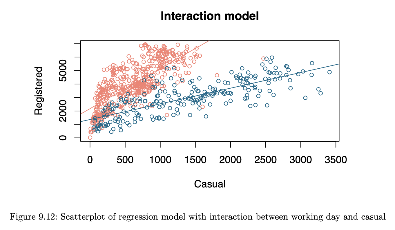
In L6 Introduction to SAS we encountered data on bike rentals. Here we attempt to model the number of registered users on the number of casual users.
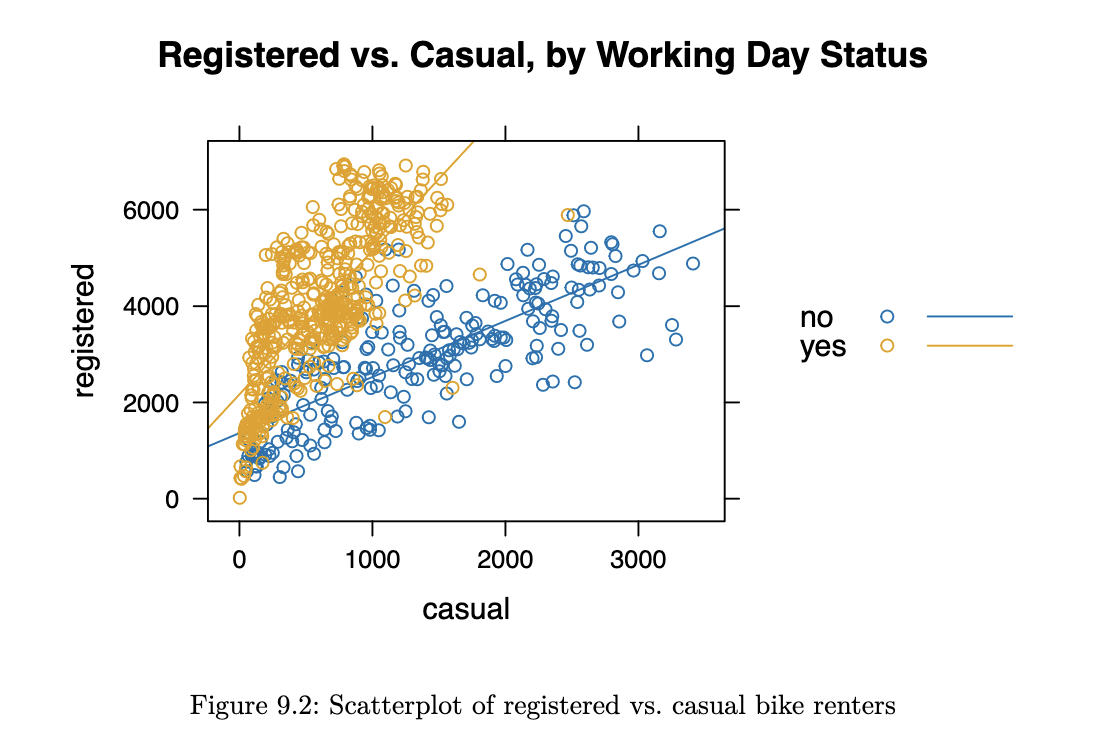
Contingent on whether the day is a working one or not, it does appear that the trendline is different.
Simple Linear Regression
Formal Set-up
The simple linear regression model is applicable when we have observations for n individuals. For now, let’s assume both the X and Y variables are quantitative.
Equation 9.1
The simple linear regression model is given by
where:
- is the intercept term
- is the slope, and
- is an error term, specific to each individual in the dataset
Equation 9.2
and are unknown constants that need to be estimated from the data. There is an implicit assumption in the formulation of the model that there is a linear relationship between and . In terms of distributions, we assume that the are iid Normal.
The constant variance assumption is also referred to as homoscedasticity. The validity of the above assumptions will have to be checked after the model is fitted. All in all, the assumptions imply that:
- The ‘s are independent
- The ‘s are Normally distributed
Estimation
Equation 9.3
Before deploying or using the model, we need to estimate optimal values to use for the unknown and . We shall introduce the method of Ordinary Least Squares (OLS) for the estimation. Let us define the error Sum of Squares to be:
Then the OLS estimates of and are given by
The minimisation above can be carried out analytically, by taking partial derivative with respect to the two parameters and setting them to 0.
Solving and simplifying, we arrive at the following:
where
If we define the following sums:
then a form convenient for computation of is
Once we have the estimates, we can use Equation 9.1 to compute fitted values for each observation. These correspond to our best guess of the mean of the distributions from which the observations arose:
Equation 9.4
As always, we can form residuals as the deviations from fitted values.
Residuals are our best guess at the unobserved error terms . Squaring the residuals and summing over all observations, we can arrive at the following decomposition, which is very similar to the one in the ANOVA model:
where:
- is known as the total sum of squares
- is known as the residual sum of squares
- is known as the regression sum of squares
In our model, recall from Equation 9.2 that we had assumed equal variance for all our observations. We can estimate with
Equation 9.5 & 9.6
Our distributional assumptions lead to the following for our estimates and :
The above are used to construct confidence intervals for and , based on t-distributions.
Hypothesis Test for Model Significance
This is to test if the coefficient is significantly different from 0. It is essentially a test of whether it was worthwhile to use a regression model of the form in Equation 9.1 instead of a simple mean to represent the data.
The null and alternative hypotheses are:
Equation 9.7
The test statistic is
Equation 9.8
Under the null hypothesis,
It is also possible to perform this same test as a t-test, using the result earlier. The statement of the hypotheses is equivalent to the F-test. The test statistic:
Under , the distribution of is . This t-test and the earlier F-test in this section are identical. It can be proved that ; the obtained p-values will be identical.
Coefficient of Determination,
The coefficient of determination is defined as
It can be interpreted as the proportion of variation in , explained by the inclusion of . Since , we can easily prove that . The larger the value of is, the better the model is.
When we get to the case of multiple linear regression, take note that simply including more variables in the model can increase . This is undesirable, it is preferable to have a parsimonious model (uses the minimum number of parameters necessary to explain a given phenomenon) that explains the response variable well.
Example 9.3 (Concrete Data Model)
In this example, we focus on the estimation of the model parameters for the two variables we introduced in Example 9.1 (Concrete Data Flow on Water)
R code
concrete <- read.csv("data/concrete+slump+test/slump_test.data")
names(concrete)[c(1,11)] <- c("id", "Comp.Strength")
lm_flow_water <- lm(FLOW.cm. ~ Water, data=concrete)
summary(lm_flow_water)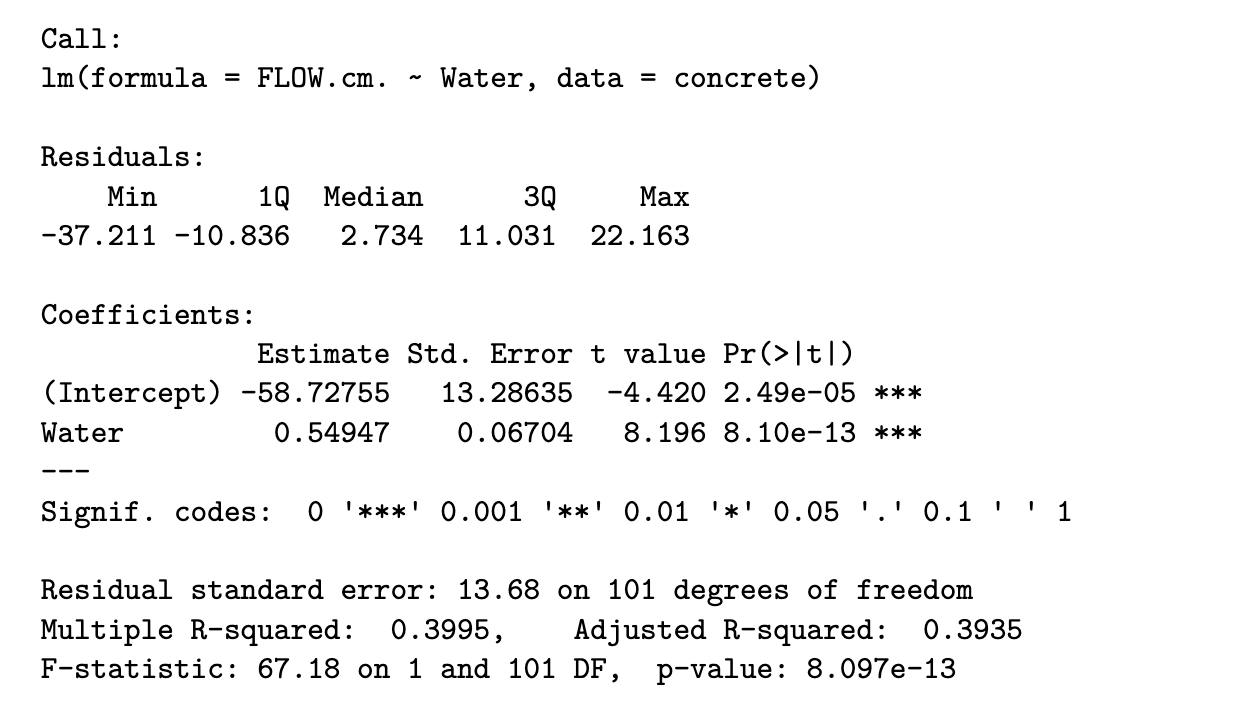
Python code
import pandas as pd
import numpy as np
import statsmodels.api as sm
from statsmodels.formula.api import ols

concrete = pd.read_csv("../data/concrete+slump+test/slump_test.data")
concrete.rename(columns={'No':'id',
                         'Compressive Strength (28-day)(Mpa)':'Comp_Strength',
                         'FLOW(cm)': 'Flow'},
                inplace=True)
lm_flow_water = ols('Flow ~ Water', data=concrete).fit()
print(lm_flow_water.summary())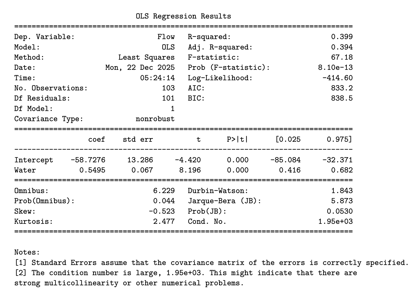
SAS output
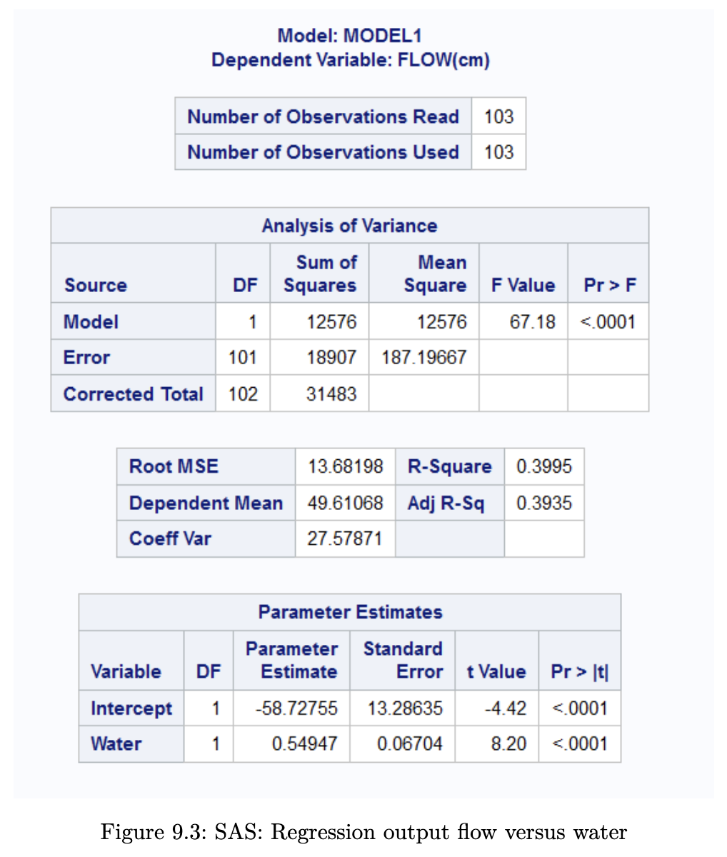
From the output, we note that the estimated model for Flow (Y) against Water (X) is:
The estimates are and . This is the precise equation that was plotted in Figure 9.1. The was labelled as “Multiple R-squared” in the R output. The value is 0.3995, which means that about 40% of the variation in Y is explained by X.
A simple interpretation of the model is as follows:
For every 1 unit increase in Water, there is an average associated increase in Flow rate of 0.55 units.
To obtain confidence intervals for the parameters, we can use the following code in R. The Python summary already contains the confidence intervals.
R code
confint(lm_flow_water)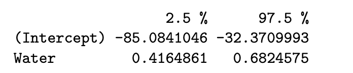
We can read off that the 95% Confidence Intervals are:
- for : (-85.08, -32.37)
- for : (0.42, 0.68)
Example 9.4 (Bike Data F-test)
We shall fit a simple linear regression model to the bike data, constrained to the non-working days.
Take note that in this example, in the R and Python output, we print an analysis of variance table instead of using the summary() methods. The latter provides coefficient estimates, but the former output only returns a sum-of-squares breakdown.
R code
bike2 <- read.csv("data/bike2.csv")
bike2_sub <- bike2[bike2$workingday == "no", ]
lm_reg_casual <- lm(registered ~ casual, data=bike2_sub)
anova(lm_reg_casual)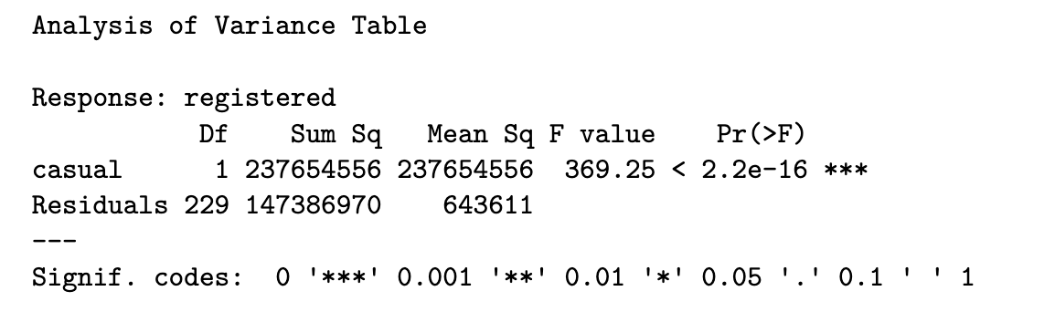
Python code
bike2 = pd.read_csv("../data/bike2.csv")
bike2_sub = bike2[bike2.workingday == "no"]

lm_reg_casual = ols('registered ~ casual', bike2_sub).fit()
anova_tab = sm.stats.anova_lm(lm_reg_casual,)
anova_tab
SAS output
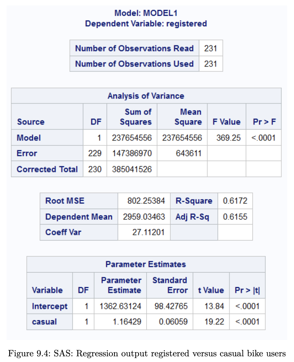
The output above includes the sum-of-squares that we need to perform the F-test outlined in Hypothesis Test for Model Significance. From the output table, we can see that = 237654556 and = 147386970. The value of for this dataset is 369.25. The p-value is extremely small (2 x 10^-16), indicating strong evidence against H_0, ie. that
If you observe carefully in Example 9.3 (Concrete Data Model) , the output from R contains both the t-test for significance of and the F-test statistic based on sum-of-squares. The p-value in both cases is 8.10 x 10^-13.
In linear regression, we almost always wish to use the model to understand what the mean of future observations would be. In the concrete case, we may wish to use the model to understand how the Flow test output values change as the amount of Water in the mixture changes. This is because, based on our formulation
After estimating the parameters, we would have:
Thus we can vary the values of X to study how much the mean of Y changes. Here is how we can do so in the concrete model for data.
Example 9.5
R code
new_df <- data.frame(Water = seq(160, 240, by = 5))
conf_intervals <- predict(lm_flow_water, new_df, interval="conf")

plot(concrete$Water, concrete$FLOW.cm., ylim=c(0, 100),
     xlab="Water", ylab="Flow", main="Confidence Bands for Flow vs. Water")
abline(lm_flow_water, col="red")
lines(new_df$Water, conf_intervals[,"lwr"], col="red", lty=2)
lines(new_df$Water, conf_intervals[,"upr"], col="red", lty=2)
legend("bottomright", legend=c("Fitted line", "Lower/Upper CI"),
       lty=c(1,2), col="red")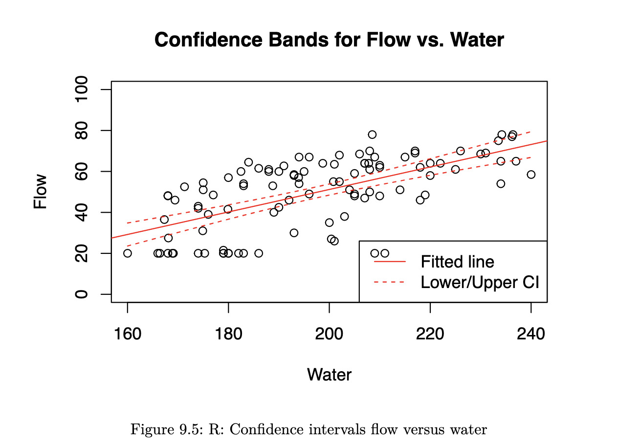
Python code
new_df = sm.add_constant(pd.DataFrame({'Water' : np.linspace(160,240, 10)}))

predictions_out = lm_flow_water.get_prediction(new_df)

ax = concrete.plot(x='Water', y='Flow', kind='scatter', alpha=0.5 )
ax.set_title('Confidence Bands for Flow vs. Water');
ax.plot(new_df.Water, predictions_out.conf_int()[:, 0].reshape(-1),
        color='blue', linestyle='dashed');
ax.plot(new_df.Water, predictions_out.conf_int()[:, 1].reshape(-1),
        color='blue', linestyle='dashed');
ax.plot(new_df.Water, predictions_out.predicted, color='blue');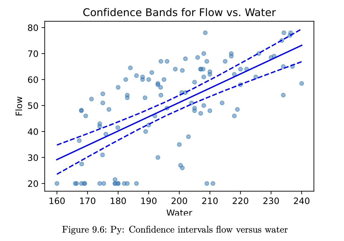
SAS output
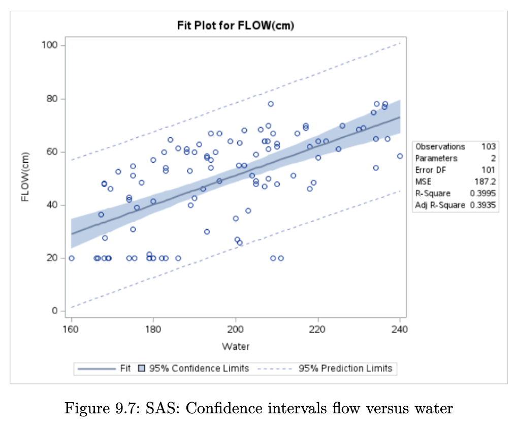
The fitted line is the straight line formed using and . The dashed lines are 95% Confidence Intervals for E(Y|X), for varying values of X. They are formed by joining up the lower bounds and upper bounds separately. Notice how the limits get wider the further away we are from .
Multiple Linear Regression
Formal Setup
When we have more than 1 explanatory variable, we turn to multiple linear regression - generalised version of what we have been dealing with so far. We would still have observed information from n individuals, but for each one, we now observe a vector of values:
Equation 9.9
In other words, we observe p independent variables and 1 response variable for each individual in our dataset. The analogous equation to Equation 9.1 is
It is easier to write things with matrices for multiple linear regression:
With the above matrices, we can re-write Equation 9.9 as
We retain the same distributional assumptions as in Formal Set-up
Estimation
Similar to Estimation, we can define to be
Minimising the above cost function leads to the OLS estimates:
The fitted values can be computed with
Residuals are obtained as
Finally, we estimate using
Coefficient of Determination
In the case of multiple linear regression, is calculated exactly as in simple linear regression, and its interpretation remains the same:
However, note that can be inflated simply by adding more terms to the model (even insignificant terms). Thus, we use the adjusted , which penalises the model for adding more and more terms to the model:
Hypothesis Tests
The F-test in the multiple linear regression helps determine if our regression model provides any advantage over the simple mean model. The null and alternative hypotheses are:
Equation 9.11
The test statistic is
Under the null hypothesis, .
It is also possible to test for the significance of individual terms, using a -test. The output is typically given for all the coefficients in a table. The statement of the hypotheses pertaining to these tests is:
However, note that these -tests are partial because it should be interpreted as a test of the contribution of , given that all other terms are already in the model.
Example 9.6 (Concrete Data Multiple Linear Regression).
In this second model for concrete, we add a second predictor variable, Slag. The updated model is
where corresponds to Water, and corresponds to Slag.
R code
lm_flow_water_slag <- lm(FLOW.cm. ~ Water + Slag, data=concrete)
summary(lm_flow_water_slag)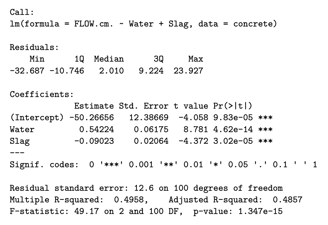
Python code
lm_flow_water_slag = ols('Flow ~ Water + Slag', data=concrete).fit()
print(lm_flow_water_slag.summary())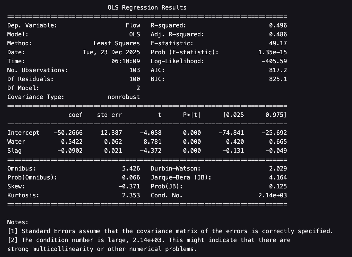
SAS output
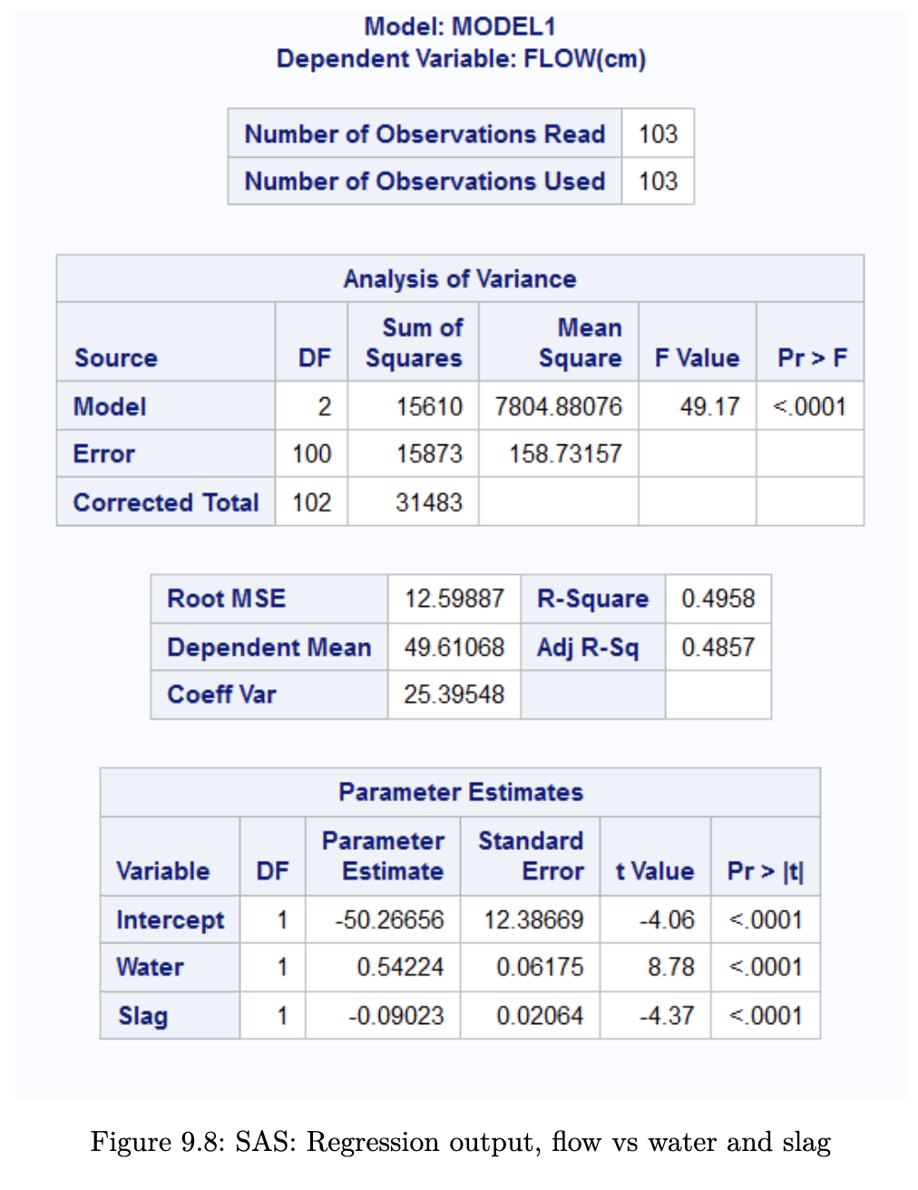
The F-test is now concerned with the hypotheses:
From the output above, we can see that , with a corresponding p-value of . The individual t-tests for the coefficients all indicate significant differences from 0. The final estimated model can be written as
Notice that the coefficients have changed slightly from the model in Example 9.3 (Concrete Data Model). Notice also that we have an improved of 0.50. However, as we pointed out earlier, we should be using the adjusted , which adjusts for the additional variable included. This value is 0.49.
While we seem to have found a better model than before, we still have to assess if all the assumptions listed in Formal Set-up have been met. We shall do so in the subsequent sections.
Indicator Variables
Including a Categorical Variable
The explanatory variables in a linear regression model do not need to be continuous. Categorical variables can also be included in the model. In order to include them, they have to be coded using dummy variables.
For instance, suppose that we wish to include gender in a model as . There are only two possible genders in our dataset: Female and Male. We can represent as an indicator variable, with
The model (without subscripts for the individuals) is then:
For females, the value of is 0. Hence the model reduces to
On the other hand, for males, the model reduces to
The difference between the two models is in the intercept. The other coefficients remain the same.
In general, if the categorical variable has levels, we will need columns of indicator variables to represent it. This is in contrast to machine learning models which use one-hot encoding. The latter encoding results in columns that are linearly dependent if we include an intercept term in the model.
Example 9.7 (Bike Data Working Day)
In this example, we shall improve on the simple linear regression model from Example 9.4 (Bike Data F-test).
R code
lm_reg_casual2 <- lm(registered ~ casual + workingday, data=bike2)
summary(lm_reg_casual2)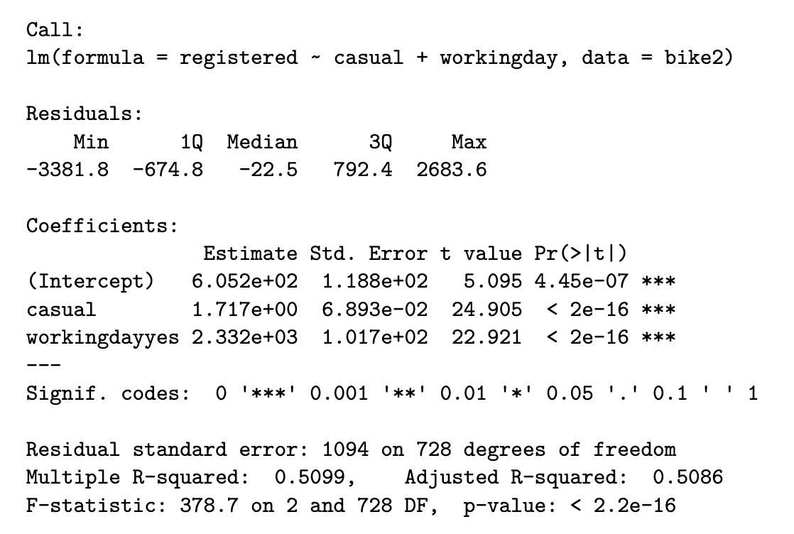
Python code
lm_reg_casual2 = ols('registered ~ casual + workingday', bike2).fit()
print(lm_reg_casual2.summary())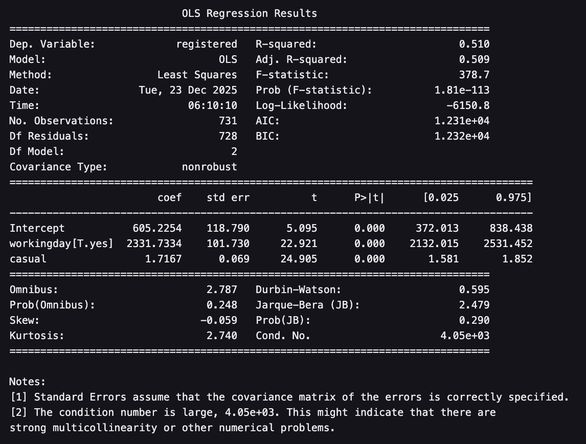
SAS output
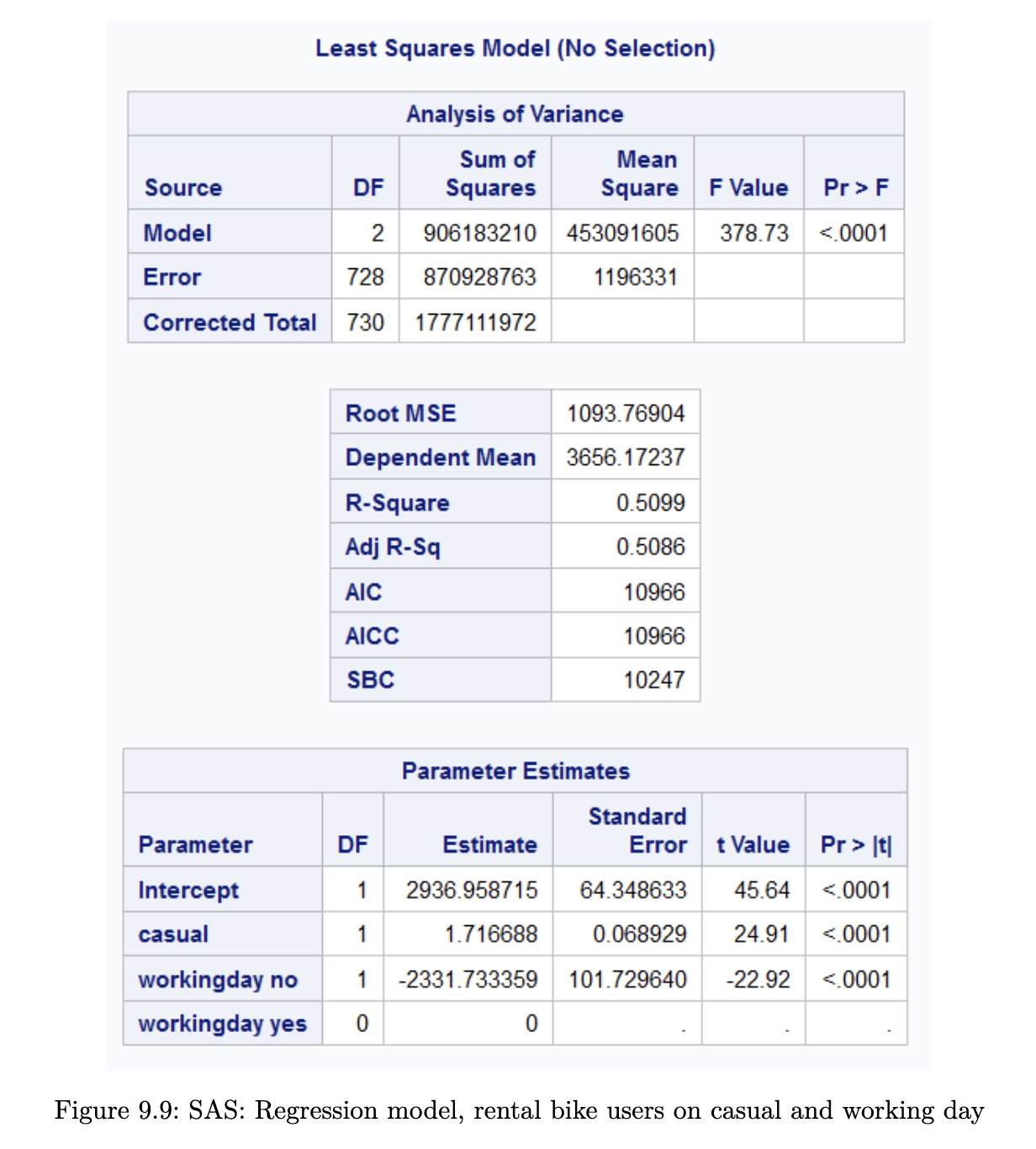
The estimated model is now
But for working days and for non-working days. This results in two separate models for the two types of days:
We can plot the two models on the scatterplot to see how they work better than the original model.
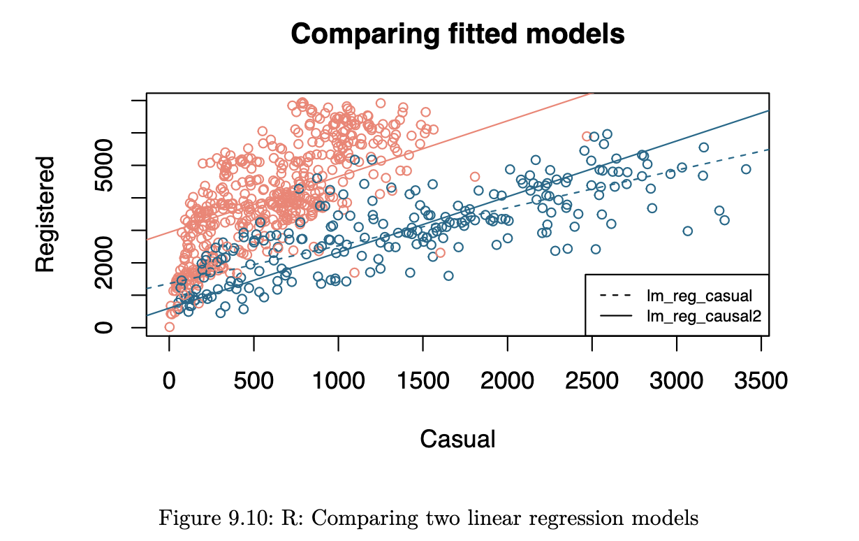
The dashed line corresponds to the earlier model, from Example 9.7 (Bike Data Working Day). With the new model, we have fitted separate intercepts to the two days, but the same slope. The benefit of fitting the model in this way, instead of breaking up the data into two portions and a different model on each one is that we use the entire dataset to estimate the variability.
If we wish to fit separate intercepts and slopes, we need to include an interaction term.
Interaction Term
A more complex model arises from an interaction between two terms. Here, we shall consider an interaction between a continuous variable and a categorical explanatory variable. Suppose that we have three predictors: height (), weight () and gender (). As spelt out in Section 9.5.1, we should use indicator variables to represent in the model.
If we were to include an interaction between gender and weight, we would be allowing for males and females to have separate coefficients for . Here is what the model would appear as:
Remember that will be 1 for males and 0 for females. The simplified equation for males would be:
For females, it would be:
Both the intercept and coefficient of are different now. Recall that in Including a Categorical Variable, only the intercept term was different.
Example 9.8 (Bike Data Working Day)
Finally, we include an interaction in the model, resulting in separate intercepts and slopes.
R code
lm_reg_casual3 <- lm(registered ~ casual * workingday, data=bike2)
summary(lm_reg_casual3)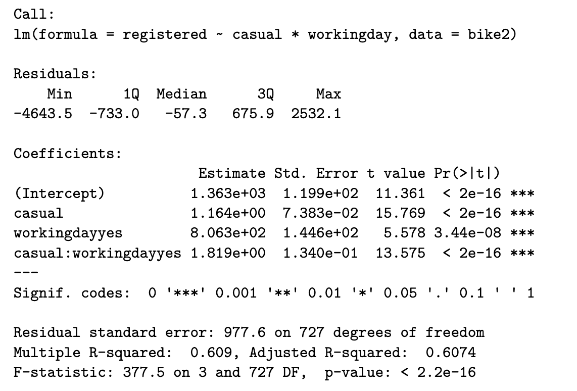
Python code
lm_reg_casual3 = ols('registered ~ casual * workingday', bike2).fit()
print(lm_reg_casual3.summary())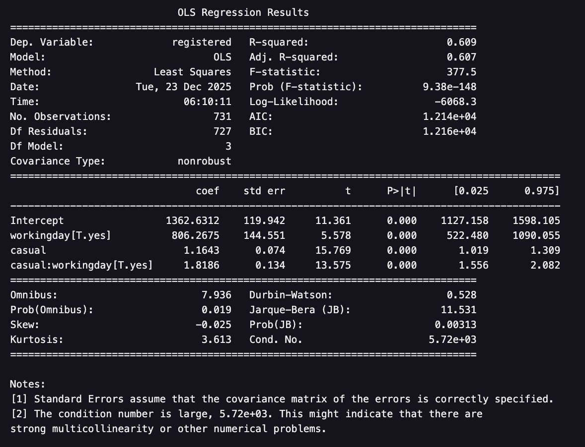
SAS output
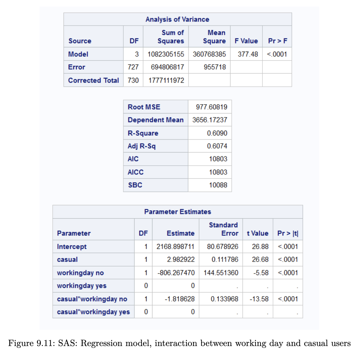
Notice that has increased from 50.8% to 60.7%. The estimated models for each type of day are:
Here is visualisation of the lines that have been estimated for each sub-group of day. This is the image that we had earlier on in Example 9.2 (Bike Rental Data).
Residual Diagnostics
Recall from Equation 9.4 that residuals are computed as
Residual analysis is a standard approach for identifying how we can improve a model. In the case of linear regression, we can use the residuals to asses if the distributional assumptions hold. We can also use residuals to identify influential points that are masking the general trend of other points. Finally, residuals can provide direction on how to improve the model.
Standardised Residuals
It can be shown that the variance of the residuals is in fact not constant. Let us define the hat-matrix as
The diagonal values of will be denoted , for . It can then be shown that
As such, we use the standardised residuals when checking if the assumption of Normality has been met.
If the model fits well, standardised residuals should look similar to a distribution. In addition, large values of the standardised residual indicate potential outlier points.
By the way, is also referred to as the leverage of a point. It is a measure of the potential influence of a point (on the parameters, and future predictions). is a value between 0 and 1. For a model with p parameters, the average should be . We consider points for whom to be high leverage points.
Normality
Example 9.9 (Concrete Data Normality Check)
R code
r_s <- rstandard(lm_flow_water_slag)
hist(r_s)
qqnorm(r_s)
qqline(r_s)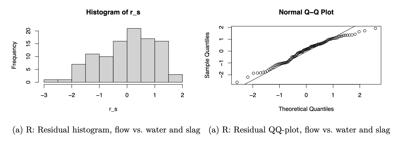
Python code
r_s = pd.Series(lm_flow_water_slag.resid_pearson)
r_s.hist()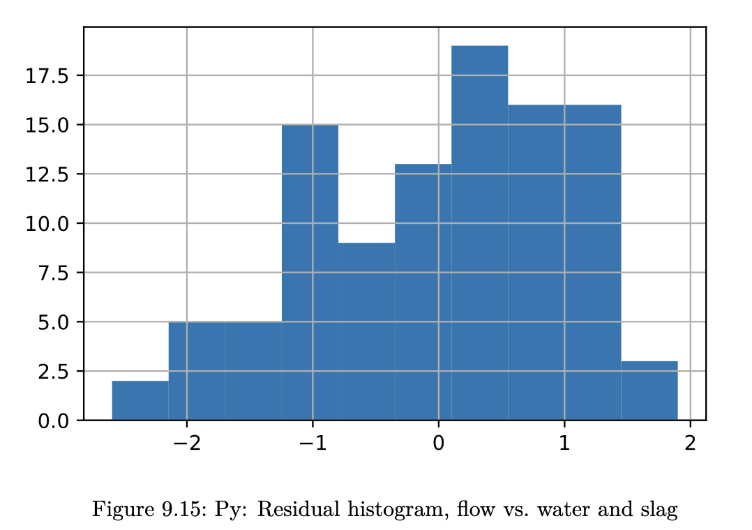
While it does appear that we have slightly left-skewed data, the departure from Normality seems to arise mostly from a thinner tail on the right.
shapiro.test(r_s)
##
## Shapiro-Wilk normality test
##
## data: r_s
## W = 0.97223, p-value = 0.02882
ks.test(r_s, "pnorm")
##
## Asymptotic one-sample Kolmogorov-Smirnov test
##
## data: r_s
## D = 0.08211, p-value = 0.491
## alternative hypothesis: two-sided
At the 5% level, the two Normality tests do not agree on the result either. In any case, we should keep in mind where Normality is needed most: in the hypothesis tests. The estimated model is still valid - it is still the best fitting line according to the least-squares criteria.
Scatterplots
To understand the model fit better, a set of scatterplots are typically made. These are plots of standardised residuals (on the y-axis) against:
- fitted values
- explanatory variables, one at a time
- potential variables
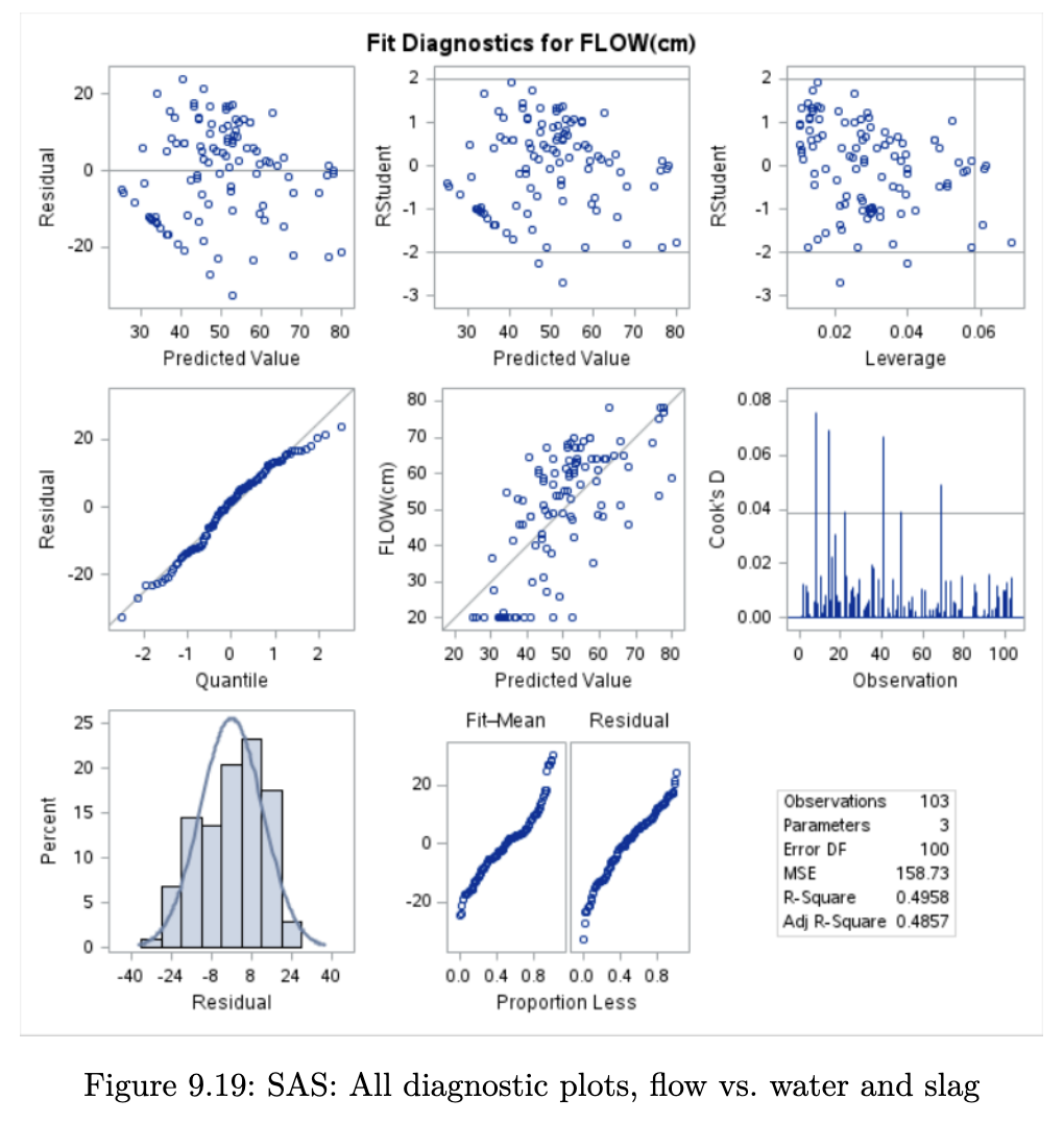
Residuals are meant to contain only the information that our model cannot explain. Hence, if the model is good, the residuals should only contain random noise. There should be no apparent pattern to them. If we find such a pattern in one of the above plots, we would have some clue as to how we could improve the model.
We typically inspect the plots for the following patterns:
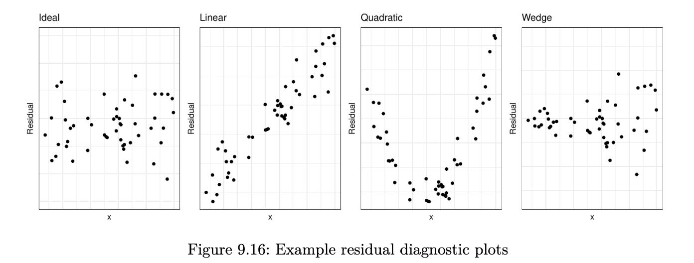
(left to right)
- A pattern lie this is ideal. Residuals are randomly distributed around zero; there is no pattern or trend in the plot.
- The second plot is something rarely seen. It would probably appear if we were to plot residuals against a new variable that is not currently in the model. If we observe this plot, we should then include this variable in the model.
- This plot indicates we should include a quadratic term in the model.
- The wedge (or funnel) shape indicates that we do not have homoscedasticity. The solution to this is either a transformation of the response or weighted least squares.
Example 9.10 (Concrete Data Residual Plots)
R code
opar <- par(mfrow=c(1,3))
plot(x=fitted(lm_flow_water_slag), r_s, main="Fitted")
plot(x=concrete$Water, r_s, main="X1")
plot(x=concrete$Slag, r_s, main="X2")
par(opar)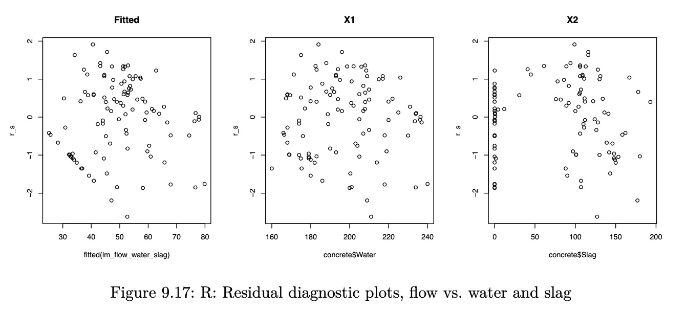
SAS Plots
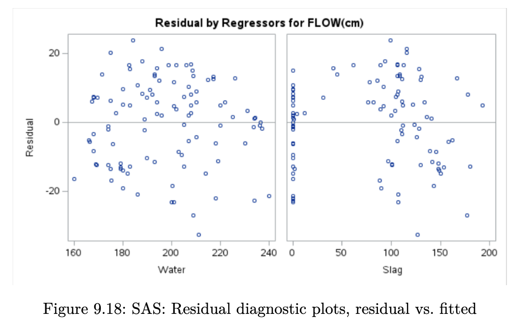
While the plots of residuals versus explanatory variables look satisfactory, the plot of the residual versus fitted values appears to have funnel shape. Coupled with the observations about the deviations from Normality of the residuals in Example 9.6 (Concrete Data Multiple Linear Regression)., we might want to try a square transform of the response.
Influential Points
The influence of a point on the inference can be judged by how much the inference changes with and without the point. For instance to assess if point i is influential on coefficient j:
- Estimate the model coefficients with all the data points
- Leave out the observations one at a time and re-estimate the model coefficients.
- Compare the ‘s from step 2 with the original estimate from step 1.
While the above method assesses influence on parameter estimates, Cook’s distance performs a similar iteration to assess the influence on the fitted values. Cook’s distance values greater than 1 indicate possibly influential points.
Example 9.11 (Concrete Data Influential Points)
R code
infl <- influence.measures(lm_flow_water_slag)
summary(infl)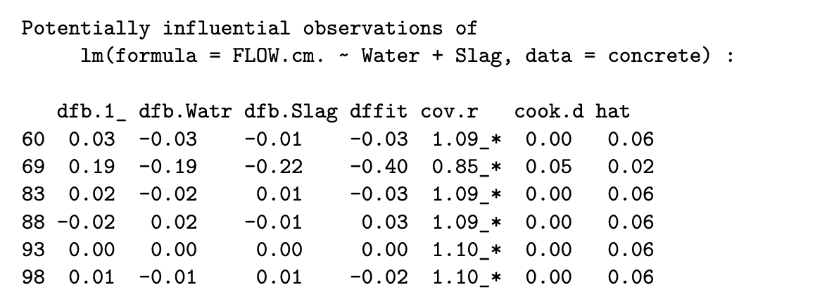
The set of 6 points above appear to be influencing the covariance matrix of the parameter estimates greatly. To proceed, we would typically leave these observations out one-at-a-time to study the impact on our eventual decision.
SAS Output