a variable is known as a categorical variable is each observation belongs to one of a set of categories. eg. gender, religion, race and type of residence.
categorical variables are typically modelled using discrete random variables, which are strictly defined in terms of whether or not the support is countable.
another method for distinguishing between quantitative and categorical variables is to ask if there is a meaningful distance between any two points in the data. if such a distance is meaningful then we have quantitative data.
there are two sub-types of categorical variables:
- a categorical variable is ordinal if the observations can be ordered, but do not have specific quantitative values.
- a categorical variable is nominal if the observations can be classified into categories, but the categories have no specific ordering
Contingency Tables
in a contingency table, each observation from the dataset falls in exactly one of the cells. the sum of all entries in the cells equals the number of independent observations in the dataset.
Visualisations
Bar charts
example 4.2
R code
library(lattice)
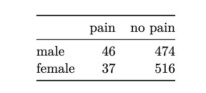
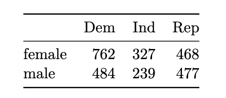
x <- matrix(c(762,327,468,484,239,477), ncol=3, byrow=TRUE)
dimnames(x) <- list(c("female", "male"),
c("Dem", "Ind", "Rep"))
political_tab <- as.table(x)
barchart(political_tab/rowSums(political_tab),
main="Political association by gender",
horizontal = FALSE, auto.key=TRUE)
example 4.3
Python code
import numpy as np
import pandas as pd

claritin_tab = np.array([[4, 184], [2, 260]])
claritin_prop = claritin_tab/claritin_tab.sum(axis=1).reshape((2,1))

xx = pd.DataFrame(claritin_prop,
				columns=['nervous', 'not_nervous'],
				index=['claritin', 'placebo'])

ax = xx.plot(kind='bar', stacked=False, rot=1.0, figsize=(10,4),
			title='Nervousness by drug')
ax.legend(loc='upper left');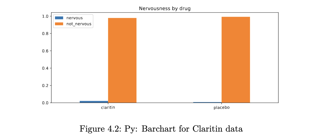
Mosaic Plots
unlike a bar chart, a mosaic plot reflects the count in each cell (through the area), along with the proportions of interest.
R code
mosaicplot(political_tab, shade=TRUE, main="Political association by gender")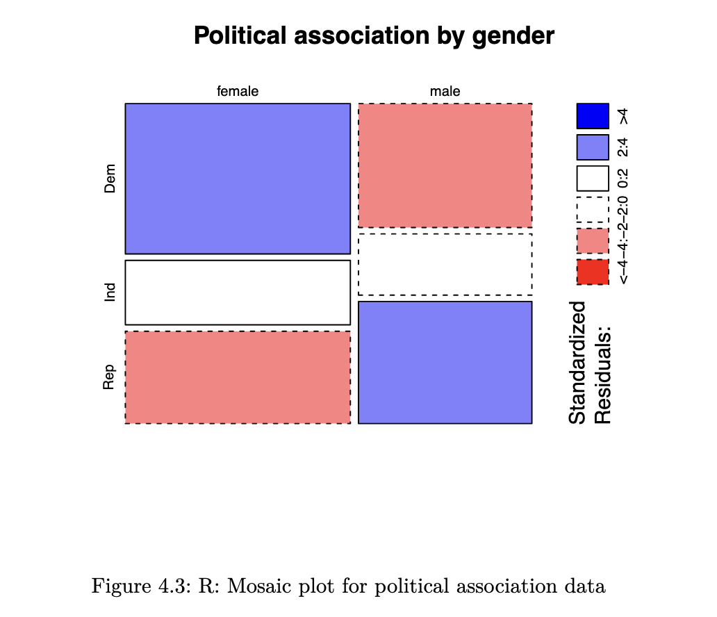
- Blue means there are more observations in that cell than would be expected under the null model (independence).
- Red means there are fewer observations than would have been expected.
- You can read this as showing you which cells are contributing to the significance of the chi-squared test result.
Python code
from statsmodels.graphics.mosaicplot import mosaic
import matplotlib.pyplot as plt

political_tab = np.asarray([[762,327,468], [484,239,477]])
mosaic(political_tab, statistic=True, gap=0.05);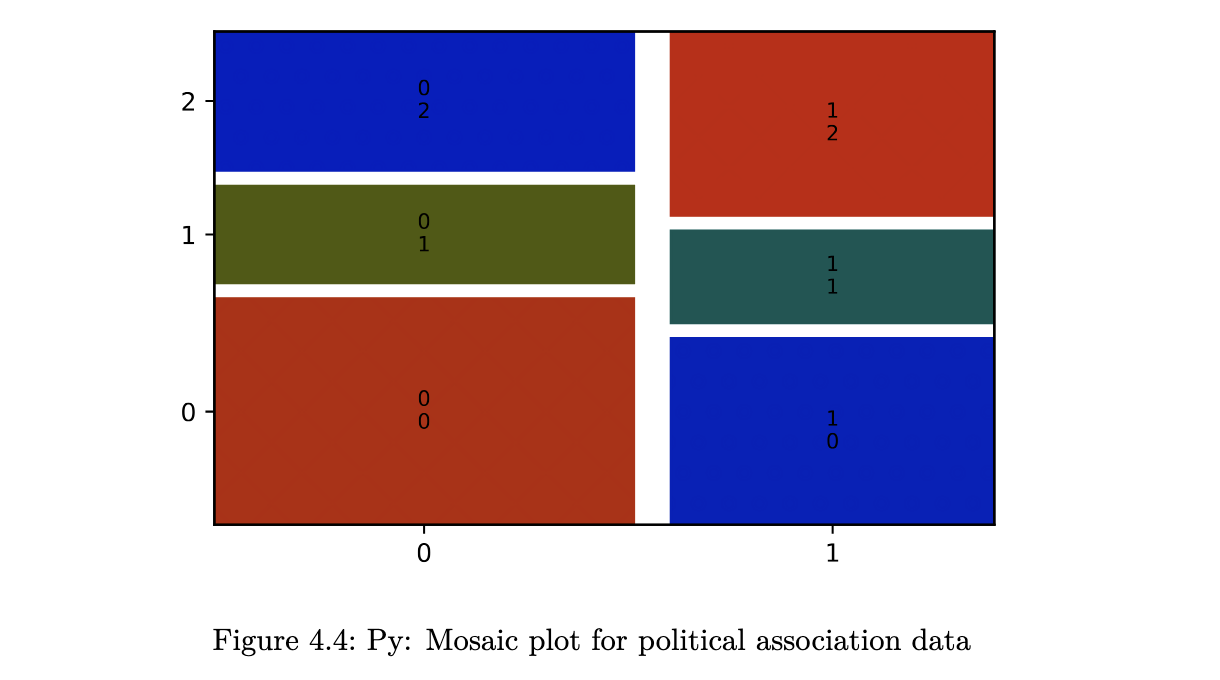
Conditional Density Plots
when we have one categorical and one quantitative variable, the kind of plot we make really depends on which is the response and which is the explanatory variable. if the response variable is the quantitative one, it makes sense to create boxplots or histograms. however, if the response variable is the categorical one, we should be making something along these lines:
R code
# primary variable of interest was whether patients died or not
# suppose we wish to plot how this varied with age (a quantitative var)

data_path <- file.path("data", "heart+failure+clinical+records",
				"heart_failure_clinical_records_dataset.csv")
heart_failure <- read.csv(data_path)

spineplot(as.factor(DEATH_EVENT) ~ age, data=heart_failure,
		ylab = "Death", xlab="Age", main="Proportion dying, by age")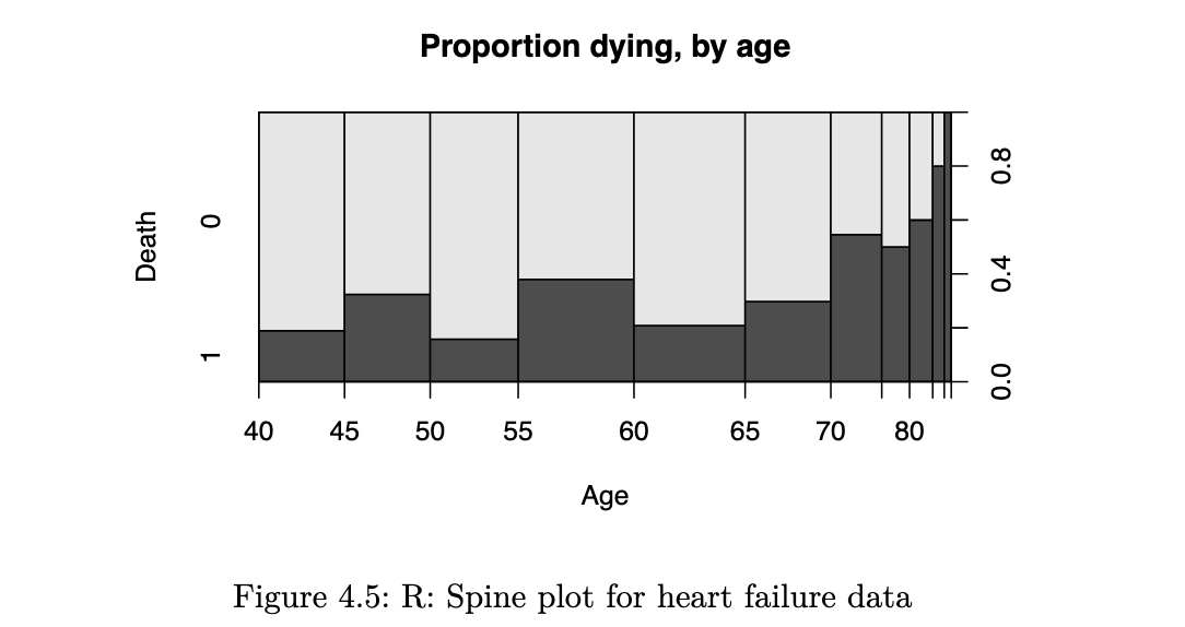
it reflects how the probability of an event varies with the quantitative explanatory variable. a smoothed version of this is known as the conditional density plot:
cdplot(as.factor(DEATH_EVENT) ~ age, data=heart_failure,
		ylab = "Death", xlab="Age", main="Proportion dying, by age")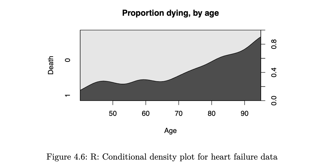
Tests for Independence
if two categorical variables are independent, then the joint distribution of the variables would be equal to the product of the marginals. if two variables are not independent, we say that they are associated
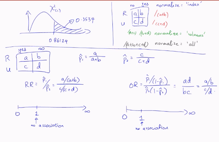
Chi-squared Test for Independence
under the null hypothesis, we can estimate the joint distribution from the observed marginal counts. based on the estimated joint distribution, we then compute expected counts (which may not be integers) for each cell. the test statistic essentially compares the deviation of observed cell counts from the expected cell counts.
example 4.6

From the estimated proportions in the “Sum” rows and columns, we can read off the following estimated probabilities
consequently, under H0, we would estimate
from a sample of size 1073, the expected count for this cell is then
using the approach above, we can derive a general formula for the expected count in each cell:
the formula for the chi-squared test statistic (with continuity correction) is:
the sum is taken over every cell in the table. hence in a 2x2 table, there would be 4 terms in the summation.
R code
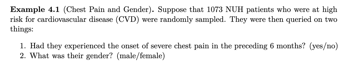
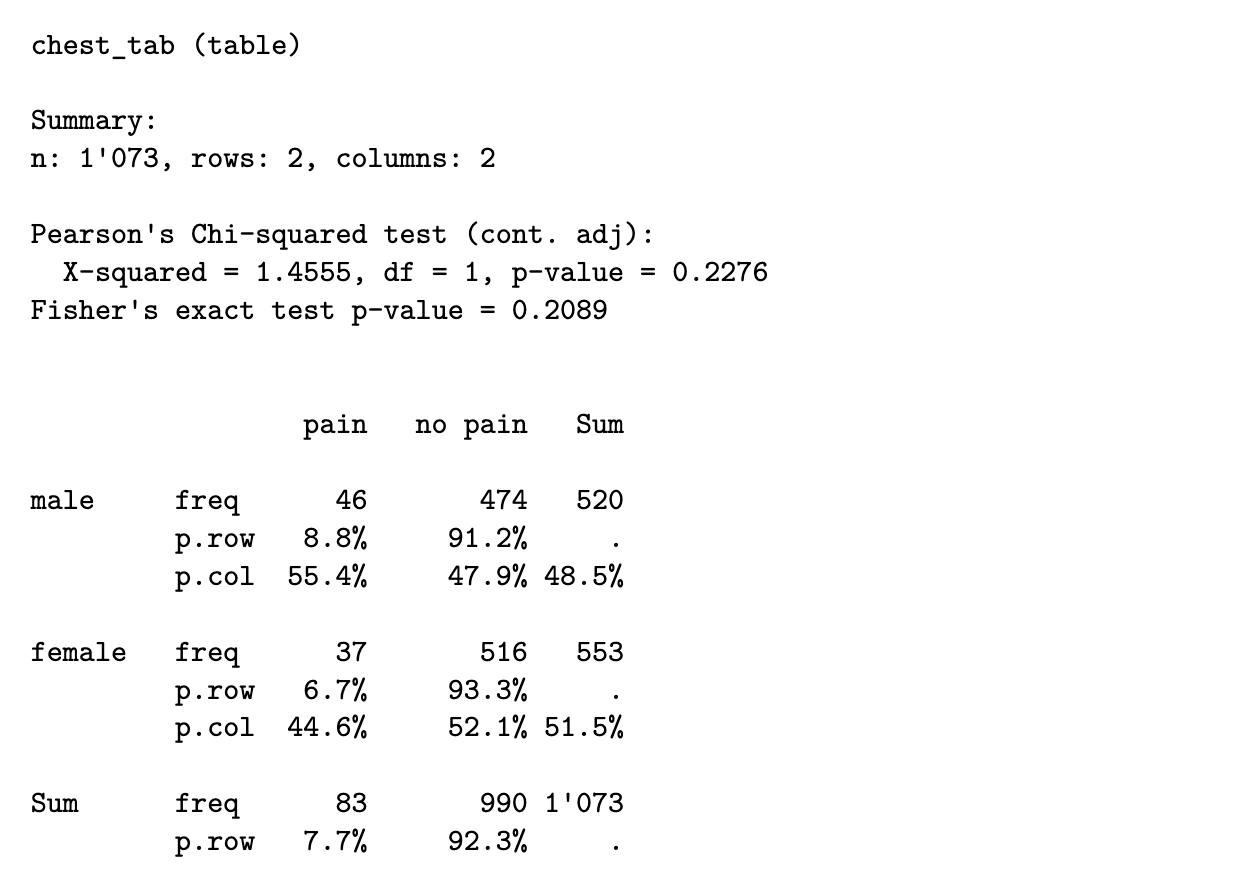
x <- matrix(c(46, 37, 474, 516), nrow=2)
dimnames(x) <- list(c("male", "female"), c("pain", "no pain"))
chest_tab <- as.table(x)

chisq_output <- chisq.test(chest_tab)
chisq_output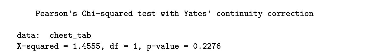
Python code
from scipy import stats

chest_array = np.array([[46, 474], [37, 516]])

chisq_output = stats.chi2_contingency(chest_array)

print(f"The p-value is {chisq_output.pvalue:.3f}.")
## The p-value is 0.228.
print(f"The test-statistic value is {chisq_output.statistic:.3f}.")
## The test-statistic value is 1.456.
since the p-value is 0.2276, we would not reject the null hypothesis at significance level 5%. we do not have sufficient evidence to conclude that the variables are not independent.
to extract the expected cell counts, we can use the following code:
R code
chisq_output$expected
Python code
chisq_output.expected_freq
the test statistic compares the above table to the observed table
Important: It is only suitable to use the chi-squared test when all expected cell counts are larger than 5
Fisher’s Exact Test
when the condition above is not met, we turn to Fisher’s Exact Test. The null and alternative hypothesis are the same, but the test statistic is not derived in the same way.
if the marginal totals are fixed, and the two variables are independent, it can be shown that the individual cell counts arise from the hypergeometric distribution, which is defined as follows:
Suppose we have an urn with 𝑚 black balls and 𝑛 red balls. From this urn, we draw a random sample (without replacement) of size 𝑘. If we let 𝑊 be the number of red balls drawn, then 𝑊 follows a hypergeometric distribution. The pmf is:
to transfer this to the context of 2x2 tables, suppose we fix the marginal counts of the table, and consider the count in the top-left corner to be a random variable following a hypergeometric distribution, with r1 red balls and r2 black balls. consider drawing a sample of size c1 from these r1 + r2 balls.
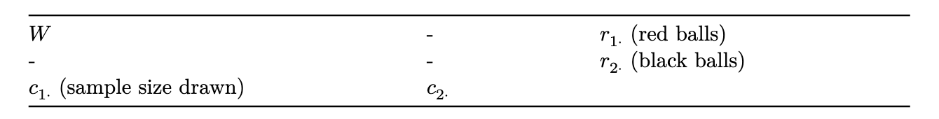
note that, assuming the marginal counts are fixed, knowledge of one of the four entries in the table is sufficient to compute all the counts in the table.
the test statistic is the observed count, w, in this cell. the p-value is calculated as
in practice, instead of summing over all values, the p-value is obtained by simulating tables with the same marginals as the observed dataset, and estimating the above probability.
using Fisher’s test sidesteps the need for a large sample size (which is required for the chi-squared approximation to hold); hence the “Exact” in the name of the test.
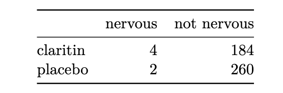
R code
y <- matrix(c(4, 2, 184, 260), nrow=2)
dimnames(y) <- list(c("claritin", "placebo"), c("nervous", "not nervous"))
claritin_tab <- as.table(y)
fisher.test(claritin_tab)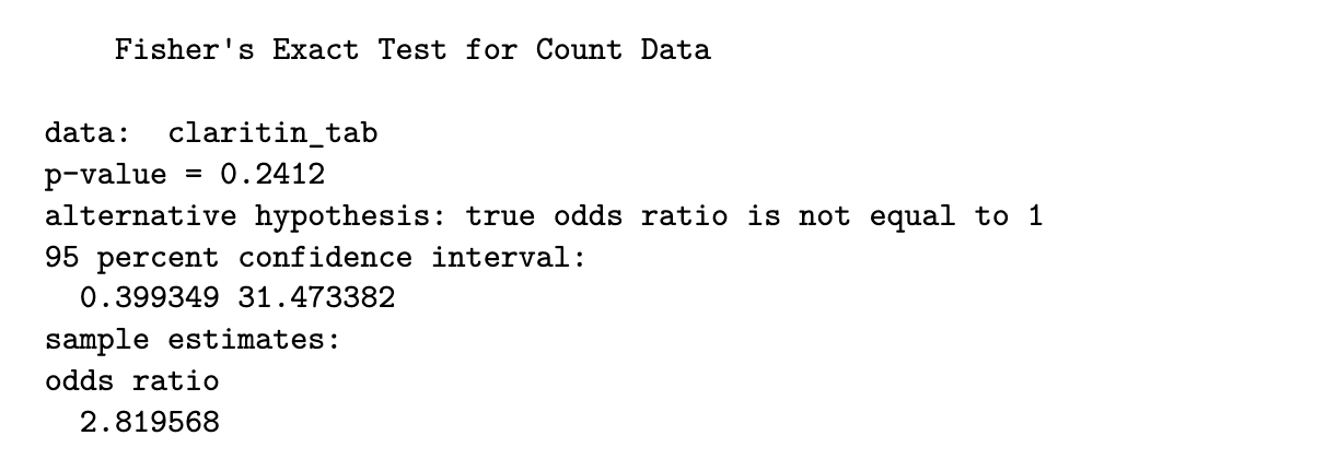
Python code
fe_output = stats.fisher_exact(claritin_tab)

print(f"The p-value for the test is {fe_output.pvalue:.4f}.")

# The p-value for the test is 0.2412.
as the p-value is 0.2412, we again do not have sufficient evidence to reject the null hypothesis and conclude that there is a significant association
by the way, we can check (in R) to see that the chi-squared test would not have been appropriate:
chisq.test(claritin_tab)$expected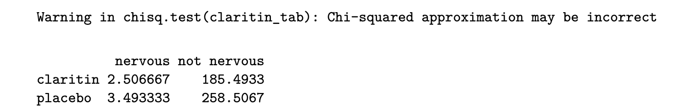
Chi-squared Test for r x c Tables
so far we have considered the situation concerning categorical variables where each has only two possible outcomes (2x2 table). however, it is common to want to check the association between two nominal variables where one fo them, or both, has more than 2 outcomes.
# R code for applying the test is identical to before
chisq.test(political_tab)

# to get the standardised residuals
chisq.test(political_tab)$stdres
in general, we might have r rows and c columns. the null and alternative hypotheses are identical to the 2x2 case, and the test statistic is computed in the same way. however, under the null hypothesis, the test statistic follows a chi-squared distribution with (r-1)(c-1) degrees of freedom.
the chi-squared test is based on a model of independence - the expected counts are derived under this assumption. as such it is possible to derive residuals and study them, to see where the data deviates from this model.
we define the standardised residuals to be:
where:
- n_ij is the observed cell count in row i and col j (cell ij)
- mu_ij is the expected cell count in row i and col j
- p_i+ is the marginal probability of row i
- p_+i is the marginal probability of col j
the residuals can be obtained from the test output. under H0, the residuals should be close to a standard Normal distribution. if the residual for a particular cell is very large (or small), we suspect that lack of fit (to the independence model) arises from that cell.
Measures of Association
Odds Ratio
the most generally applicable measure of association, for 2x2 variables, is the Odds Ratio (OR).
suppose we have X and Y to be Bernoulli random variables with (population) success probabilities p1 and p2. we define the odds of success for X to be:
similarly, the odds of success for random variable Y is
in order to measure the strength of their association, we use the odds ratio:
the odds ratio can take any value from 0 to infinity.
- a value of 1 indicates no association between X and Y. if X and Y were independent, this is precisely what we would observe.
- derivations from 1 indicate stronger association between the variables
- note that, for odds ratios, deviations from 1 are not symmetric. for a given pair of variables, an association of 0.25 or 4 is the same, it is just a matter of which variable we put in the numerator odds.
due to the above asymmetry, we often use the log-odds ratio instead:
- log-odds-ratios can take values from -inf to +inf
- a value of 0 indicates no association between X and Y
- deviations from 0 indicate stronger association between the variables, and deviations are now symmetric; a log-odds-ratio of -0.2 indicates the same strength as 0.2, just the opposite direction
to obtain a confidence interval for the odds-ratio, we work with the log-odds ratio and then exponentiate the resulting interval. here are the steps for a 2x2 table:
- suppose we label the observed counts in the table as n11, n12, n21, n22
- the sample odds ratio is
- for a large sample size, it can be shown that log OR^ follows a Normal distribution. hence a 95% confidence interval can be obtained through
where the ASE (Asymptotic Standard Error) of the estimator is
Example 4.10 (Chest Pain and Gender Odds Ratio)
R code
library(DescTools)
OddsRatio(chest_tab, conf.level = .95)
Python code
import statsmodels.api as sm
chest_tab2 = sm.stats.Table2x2(chest_array)

print(chest_tab2.summary())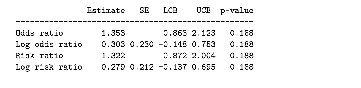
For Ordinal Variables
when both variables are ordinal, it is often useful to compute the strength (or lack) of any monotone trend association. it allows us to assess if
as the level of X increases, responses on Y tend to increase toward higher levels, or responses on Y tend to decrease towards lower levels
we shall discuss a measure for ordinal variables, analogous to Pearson’s correlation for quantitative variables, that describes the degree to which the relationship is monotone. it is based on the idea of a concordant or discordant pair of subjects.
Definition 4.1
- a pair of subjects is concordant if the subject ranked higher on X also ranks higher on Y
- a pair is discordant if the subject ranking higher on X ranks lower on Y
- a pair is tied if the subjects have the same classification on X and/or Y
if we let
- C: number of concordant pairs in a dataset
- D: number of discordant pairs in a dataset
then if C is much larger than D, we would have reason to believe that there is a strong positive association between the two variables. here are two measures of association based on C and D:
- Goodman-Kruskal is computed as
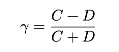
- Kendall is

where A is a normalising constant that results in a measure that works better with ties, and is less sensitive than kruskal to the cut-points defining the categories. however, kruskal has the advantage that is is more easily interpretable
for both measures, values close to 0 indicate a very weak trend, while values closer to 1 (or -1) indicate a strong positive (negative) association
R code
x <- matrix(c(1, 3, 10, 6,
			2, 3, 10, 7,
			1, 6, 14, 12,
			0, 1, 9, 11), ncol=4, byrow=TRUE)
dimnames(x) <- list(c("<15,000", "15,000-25,000",
					"25,000-40,000", ">40,000"),
				c("Very Dissat.", "Little Dissat.",
					"Mod. Sat.", "Very Sat."))
us_svy_tab <- as.table(x)

output <- Desc(x, plotit = FALSE, verbose = 3)
output[[1]]$assocs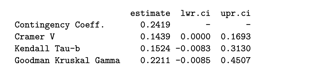
Python code
from scipy import stats

us_svy_tab = np.array([[1, 3, 10, 6],
					[2, 3, 10, 7],
					[1, 6, 14, 12],
					[0, 1, 9, 11]])
dim1 = us_svy_tab.shape
x = []; y=[]
for i in range(0, dim1[0]):
	for j in range(0, dim1[1]):
		for k in range(0, us_svy_tab[i,j]):
			x.append(i)
			y.append(j)
kt_output = stats.kendalltau(x, y)
print(f"The estimate of tau-b is {kt_output.statistic:.4f}.")

# The estimate of tau-b is 0.1524.
the output shows that both kruskal = 0.22 and kendall = 0.15 are close to significant. the lower confidence limit is close to being positive.
Further readings
In general, I have found that R packages seem to have a lot more measures of association for categorical variables. In Python, the measures are spread out across packages.
Above, we have only scratched the surface of what is available. If you are keen, do read up on:
- Somer’s D (for association between nominal and ordinal)
- Mutual Information (for association between all types of pairs of categorical variables)
- Polychoric correlation (for association between two ordinal variables)
Also, take note of how log odds ratios, 𝜏𝑏 and 𝛾 work. Firstly, values close to 0 reflect weak association. Values of 𝑎 and −𝑎 indicate the same strength, but different direction of association.
This allows the same intuition that Pearson’s correlation does. When you are presented with new metrics, try to understand them by asking similar questions about them.
stuff not in lec notes:
findInterval(x, vec)
Assigns each element of x to an interval defined by vec. Returns a 0-based index: 0 means below the first breakpoint, 1 means in the first interval, etc.
findInterval(x, c(2.5, 5.5))
# x=1 → 0, x=3 → 1, x=6 → 2
To get 1-based quartile labels (as in midterm Q2):
# all.inside=TRUE forces values at the boundaries inside an interval
stud_perf$G3_q <- findInterval(stud_perf$G3, c(0, 8, 11, 14, 20), all.inside = TRUE)
# results in labels 1, 2, 3, 4 — pass as factor to spineplot
spineplot(as.factor(G3_q) ~ absences, data = stud_perf, ...)
Key details:
all.inside = TRUEpushes boundary values inward so you always get a valid interval indexfindIntervalis vectorised — no need for aforloop- using
$notation withdata=argument inspineplotis redundant: use one or the other
Outlier Handling:
- never automatically drop
- always investigate WHY
- use term “suspected outliers”
- do the analysis twice (with and without outliers)
- see how different the recommendation is
- if the rec is the same, then it’s okay, else decide what to do
Correlation Only Measures LINEAR Association
- eg. parabolic / cubic relationship : r ≈ 0 (but clear relationship exists)
- correlation only measures linear association, thus can miss non-linear relationships completely
Your Data: Two Categorical Variables
           ↓
    ┌──────┴──────┐
    │             │
NOMINAL       ORDINAL
(no order)   (ordered)
    │             │
    ↓             ↓
Chi-square    Chi-square
Fisher's      PLUS ↓
    ↓         Gamma/Tau
    │             │
    └──────┬──────┘
           ↓
   Measure strength:
   Odds Ratio or
   Relative Risk
Quick Reference Table
| When You Have | Use This Test | Measures Strength With |
|---|---|---|
| 2 nominal variables | Chi-square | Odds Ratio |
| 2 nominal (small n) | Fisher’s Exact | Odds Ratio |
| 2 ordinal variables | Chi-square + Gamma/Tau | γ or τ_b |
| Compare 2 groups | Fisher’s or Chi-square | Relative Risk or OR |
See also: Chi-Square & Fisher · Odds Ratio & Relative Risk · Pandas Glossary · Numpy Glossary